Showing posts with label visualizations. Show all posts

Thursday, March 24, 2016

Artisanal Democracy Data: A Quick and Easy Way of Extending the Unified Democracy Scores

(Apologies for the lack of posting - I've been finishing some big projects. This is of interest primarily to people who care about quantitative measures of democracy in the 19th century, or for some unknown reason enjoy creating latent variable indexes of democracy. Contains a very small amount of code, and references to more.)

If you have followed the graph-heavy posts in this blog, you may have noticed that I really like the Unified Democracy Scores developed by Daniel Pemstein, Stephen Meserve, and James Melton. The basic idea behind this particular measure of democracy, as they explain in their 2010 article, is as follows. Social scientists have developed a wealth of measures of democracy (some large-scale projects like the Polity dataset or the Freedom in the World index, some small “boutique” efforts by political scientists for a particular research project). Though these measures are typically highly correlated (usually in the 0.8-0.9 range), they still differ significantly for some countries and years. These differences are both conceptual (researchers disagree about the essential characteristics of democracy) and empirical (researchers disagree about whether a given country-year is democratic according to a particular definition).

PMM argue that we can assume that these measures are all getting at a latent trait that is only imperfectly observed and conceptualized by the compilers of all the datasets purporting to measure democracy, and that we can estimate this trait using techniques from item response theory that were originally developed to evaluate the performance of multiple graders in academic settings. They then proceeded to do just that, producing a dataset that not only contains latent variable estimates of democracy for 9850 country-years (200 unique countries), but also estimates of the measurement error associated with these scores (derived from the patterns of disagreement between different democracy measures).

This, to be honest, is one of the main attractions of the UDS for me: I get nervous when I see a measure of democracy that does not have a confidence interval around it, given the empirical and conceptual difficulties involved in producing numerical estimates of a woolly concept like “democracy.” Nevertheless, the UDS had some limitations: for one thing, they only went back to 1946, even though many existing measures of democracy contain information for earlier periods, and PMM never made use of all the publicly available measures of democracy in their construction of the scores, which meant that the standard errors around them were relatively large. (The original UDS used 10 different democracy measures for its construction; the current release uses 12, but I count more than 25).

Moreover, the UDS haven’t been updated since 2014 (and then only to 2012), and PMM seem to have moved on from the project. Pemstein, for example, is now involved with measurement at the V-Dem institute, whose “Varieties of Democracy” dataset promises to be the gold standard for democracy measurement, so I’m guessing the UDS will not receive many more updates, if any. (If you are engaged in serious empirical research on democracy, you should probably be using the V-dem dataset anyway. Seriously, it’s amazing - I may write a post about it later this year). And though in principle one could use PMM's procedure to update these scores, and they even made available an (undocumented) replication package in 2013, I was never able to make their software work properly, and their Bayesian algorithms for estimating the latent trait seemed anyway too computationally intensive for my time and budget.

I think this situation is a pity. For my own purposes – which have to do mostly with the history of political regimes for my current project – I’d like a summary measure of democracy that aggregates both empirical and conceptual uncertainty in a principled way for a very large number of countries, just like I believe the UDS did. But I also would like a measure that goes back as far as possible in time, and is easily updated when new information arises (e.g., there are new releases of Freedom House or Polity). The new V-dem indexes are great on some of these counts (they come with confidence intervals) but not on others (they only cover 2014-1900, they are missing some countries, and the full dataset is a bit unwieldy – too many choices distract me). Other datasets – the trusty Polity dataset, the new and excellent LIED index – do go back to the 19th century, but they provide no estimates of measurement error, and they make specific choices about conceptualization that I do not always agree with.

But why wait for others to create my preferred measure when I can do it myself? So I went ahead and figured out how to first replicate the Unified Democracy scores without using a computationally intensive Bayesian algorithm, and then extended them both forwards to 2015 and backwards to the 19th century (in some cases to the 18th century), using information from 28 different measures of democracy (some of them rather obscure, some just new, like the LIED index or the latest version of the Freedom House data). And I created an R package to let you do the same, should you wish to fiddle with the details of the scores or create your own version of the UDS using different source measures. (Democratizing democracy indexes since 2016!).

The gory details are all in this paper, which explains how to replicate and extend the scores, and contains plenty of diagnostic pictures of the result; but if you only want to see the code to produce the extended UDS scores check out the package vignette here. If you are an R user, you can easily install the package and its documentation by typing (assuming you have devtools installed, and that I’ve done everything correctly on my side):

devtools::install_github(repo = "xmarquez/QuickUDS")

The package includes both my “extended” UD scores (fully documented and covering 24111 country-years going all the way to the 18th century in some cases, for 224 sovereign countries and some non-sovereign territories) and a replication dataset which includes 61 different measures of democracy from 29 different measurement efforts covering a total of 24149 country-years (also fully documented). (Even if you are not interested in the UDS, original or extended, you may be interested in that dataset of democracy scores). For those poor benighted souls who use Stata or (God fobid) some awful thing like SPSS (kidding!), you can access a CSV version of the package datasets and a PDF version of their documentation here.

To be sure, for most research projects you probably don’t need this extended Unified Democracy measure. After all, most useful variables in your typical democracy regression are unmeasured or unavailable before the 1950s for most countries, and if your work only requires going back to the 1900s, you are better off with the new V-dem data, rather than this artisanal version of the UDS. But the extended UDS is nice for some things, I think.

First, quantitative history (what I wanted the extended UDS for). For example, consider the problem of measuring democracy in the USA over the entirety of the last two centuries. Existing democracy measures disagree about when the USA first became fully democratic, primarily because they disagree about how much to weigh formal restrictions on women’s suffrage and the formal and informal disenfranchisement of African Americans in their conceptualization. Some measures give the USA the highest possible score early in the 19th century, others after the civil war, others only after 1920, with the introduction of women’s suffrage, and yet others (e.g. LIED) not until 1965, after the Civil Rights Movement. With the extended UDS these differences do not matter very much: as consensus among the different datasets increases, so does the measured US level of democracy:


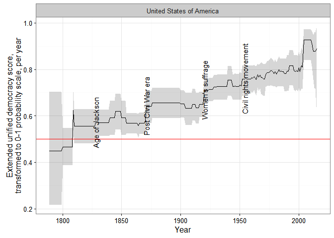
In the figure above, I use a transformed version of the extended UDS scores whose midpoint is the “consensus” estimate of the cutoff between democracy and non-democracy among minimalist, dichotomous measures in the latent variable scale. (For details, see my paper; the grey areas represent 95% confidence intervals). This version can be interpreted as a probability scale: “1” means the country-year is almost certainly a democracy, “0” means it is almost certainly not a democracy, and “0.5” that it could be either. (Or we could arbitrarily decide that 0-0.33 means the country is likely an autocracy of whatever kind, 0.33-0.66 that it is likely some kind of hybrid regime, and 0.66-1 that is pretty much a democracy, at least by current scholarly standards).

In any case, the extended UDS shows an increase in the USA’s level of democracy in the 1820s (the “Age of Jackson”), the 1870s (after the civil war), the 1920s after female enfranchisement, and a gradual increase in the 1960s after the Civil Rights movement, though the magnitude of each increase (and of the standard error of the resulting score) depends on exactly which measures are used to construct the index. (The spike in the 2000s is an artifact of measurement, having more to do with the fact that lots of datasets end around that time than with any genuine but temporary increase in the USA’s democracy score). Some of these changes would be visible in other datasets, but no other measure would show them all; if you use Polity, for example, you would see a perfect score for the USA since 1871.

Just because what use is this blog if I cannot have a huge vertical visualization, here are ALL THE DEMOCRACY SCORES, alphabetically by country:

(Grey shaded areas represent 95% confidence intervals; blue shaded areas are periods where the country is either deemed to be a member of the system of states in the Gleditsch and Ward list of state system membership since 1816, i.e., independent, or is a microstate in Gleditsch’s tentative list).


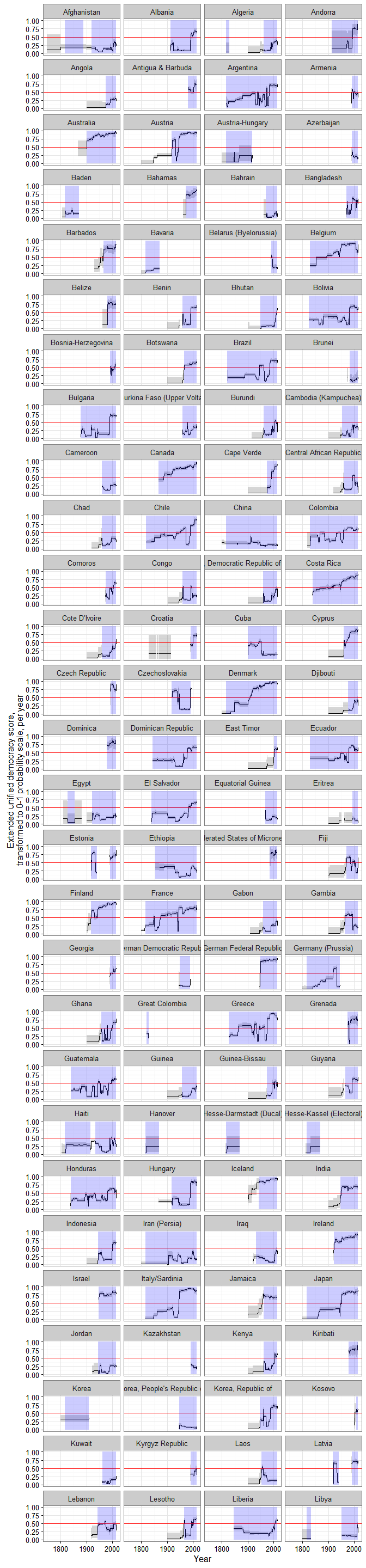
A couple of things to note. First, scores are calculated for some countries for periods when they are not generally considered to be independent; this is because some of the underlying data used to produce them (e.g., the V-Dem dataset) produce measures of democracy for existing states when they were under imperial governance (see, e.g., the graphs for India or South Korea).

Second, confidence intervals vary quite a bit, primarily due to the number of measures of democracy available for particular country-years and the degree of their agreement. For some country-years they are so large (because too few datasets bother to produce a measure for a period, or the ones that do disagree radically) that the extended UD score is meaningless, but for most country-years (as I explain in my paper) the standard error of the scores is actually much smaller than the standard error of the “official” UDS, making the measure more useful for empirical research.

Finally, maybe this is just me, but in general the scores tend to capture my intuitions about movements in democracy levels well (which is unsurprising, since they are based on all existing scholarly measures of democracy); see the graphs for Chile or Venezuela, for example. And using these scores we can get a better sense of the magnitude of the historical shifts towards democracy in the last two centuries.

For example, according to the extended UDS (and ignoring measurement uncertainty, just because this is a blog), a good 50% of the world’s population today lives in countries that can be considered basically democratic, but only around 10% live in countries with the highest scores (0.8 and above):

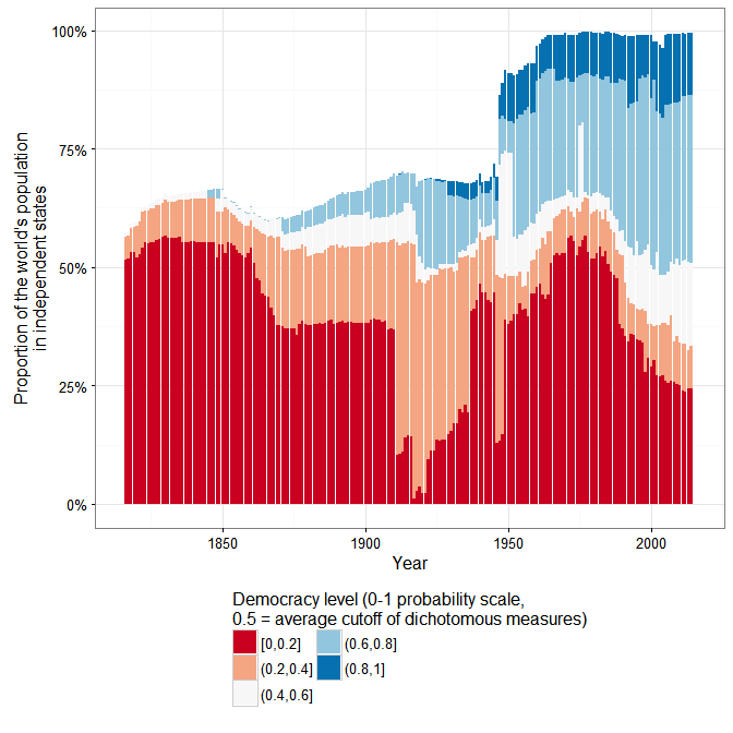
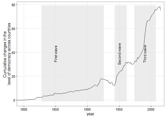
And Huntington’s three waves of democratization are clearly visible in the data (again ignoring measurement uncertainty):


But suppose you are not into quantitative history. There are still a couple of use cases where long-run, quantitative data about democracy with estimates of measurement error is likely to be useful. Consider, for example, the question of the democratic peace, or of the relationship between economic development and democracy – two questions that benefit from very long-run measures of democracy, especially measures that can be easily updated, like this one.

I may write more about this later, but here is an example about a couple of minor things this extended democracy measure might tell us about the basic stylized fact of the “democratic peace.” Using the revised list of interstate wars by Gleditsch, we can create a scatterplot of the mean extended UD score of each side in an interstate war, and calculate the 2-d density distribution of these scores while accounting for their measurement error:

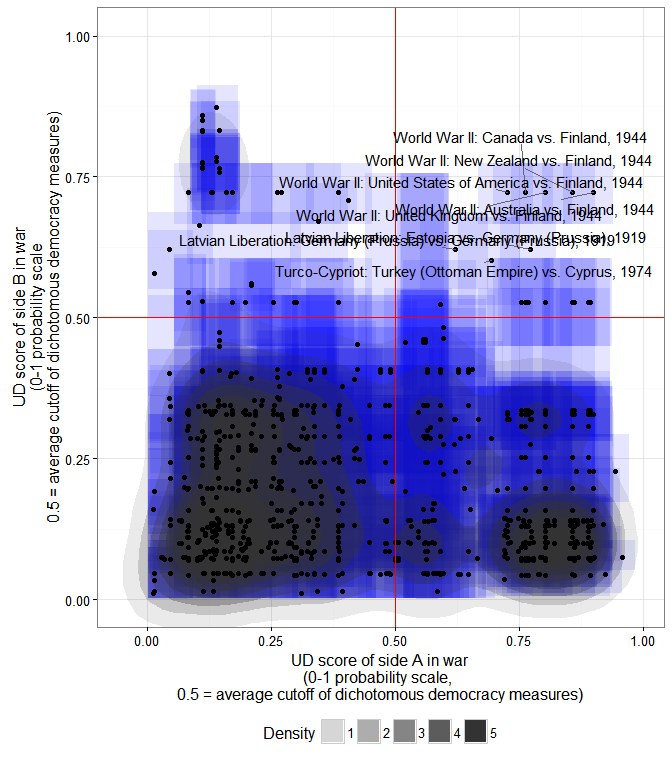
The x- coordinate of each point is the mean extended UD score (in the 0-1 probability scale where 0.5 is the average cutoff between democracy and non-democracy among the most minimalistic measures) of side A in a war listed by Gleditsch; the y-coordinate is the mean extended UD score of side B; each blue square is the 95% “confidence rectangle” around these measures; the shaded blobs are the 2-d probability densities, accounting for measurement error in the scores.

As we can see, the basic stylized fact of a dyadic democratic peace is plausible enough, at least for countries which have a high probability of being democratic. In particular, countries whose mean extended UD democracy score is over 0.8 (in the transformed 0-1 scale) have not fought one another, even after accounting for measurement error. (Though they have fought plenty of wars with other countries, as the plot indicates). But note that the dyadic democratic peace only holds perfectly if we set the cutoff for “being a democracy” quite high (0.8 is in the top 10% of country-years in this large sample; few countries have ever been that democratic); as we go down to the 0.5 cutoff, exceptions accumulate (I’ve labeled some of them).

Anyway, I could go on; if you are interested in this “artisanal” democracy dataset (or in creating your own version of these scores), take a look at the paper, and use the package – and let me know if it works!

(Update 3/25/2016 - some small edits for clarity).

(Update 3/28 - fixed code error).

(Update 3/30 - re-released the code, and updated the graphs, to fix one small mistake with the replication data for the bnr variable).

(Code for this post is available here. Some of it depends on a package I’ve created but not shared yet, so you may not be able to replicate it all.)

Friday, August 28, 2015

The Mismeasure of Growth

About six months ago, Tom Pepinsky wrote a post, on the occasion of Lee Kuan Yew’s death, where he argued graphically that Lee Kuan Yew’s claim to have taken Singapore “from Third World to First” was a bit overstated. (Yes, I’m posting about this six months later - but I have never claimed that this blog offers hot takes on the news!). Using Kristian Gleditsch’s expanded GDP data, he noted that, in percentile terms, Singapore was already quite wealthy by the time it became independent, especially when compared to its neighbours:

By this measure, Singapore was as wealthy as the UK (per capita) by the mid-1970s, not because it had grown especially fast, but because it had started from a relatively high base. On this view, the most we could say is that Singapore escaped the “middle income trap,” not so much the “third world.”

The post got a fair bit of attention, though also, as I recall, a bit of pushback on Twitter and in the comments about both the data source used (Gleditsch rather than the Penn World Table or the Maddison dataset) and the decision to look at the percentile rank of income rather than the actual per capita income. Indeed, the figure above looks different if we use the Penn World Table’s latest measure of “expenditure side real GDP, at chained PPPs” (recommended by the Penn World Table investigators for “comparison of living standards across countries and over time”):

(There’s no data for Myanmar in the PWT 8.1).

Now Singapore’s starting income rank is much closer to Malaysia’s (they were, after all, part of the same country until 1965), solidly in the middle, and does not reach the UK’s income rank until the 1990s, instead of the 1970s. The difference between the two graphs is even starker if, instead of percentile ranks, we simply look at the actual income per capita numbers in PWT8.1 vs the Gleditsch data:

Using the recommended PWT 8.1 measure, Singapore at independence in 1965 had a per capita income of around $3,000 per capita, only a bit higher than Malaysia’s, and only one-sixth of US income; using the Gleditsch data, by contrast, Singapore starts out at nearly double the income level of Malaysia (more than $6000 compared with around $3,500), about a third of US income (and about half of UK income). It’s a big head-start, and it does make Lee’s achievement look a bit less impressive (an average growth rate for the period 1965-1990, when Lee was Prime Minister, of 4.8% rather than 6.9% per year for the PWT8.1 measure). At the time, I thought that the difference between the two estimates of Singaporean GDP was simply a matter of different data sources. But when you dig deeper, it turns out that the source of Gleditsch’s numbers for Singapore was … the Penn World Table (version 8.0)!

What is going on here? In this particular case, the discrepancy is due, first, to adjustments in the 2005 PPPs used between versions 8.0 and 8.1 of the PWT that increased the base price level in many countries and years, and hence lowered their measured GDP, and second, to the fact that the Gleditsch data reports, not the “expenditure side” measure of GDP (basically real GDP adjusted for changes in the terms of trade), but the measure for “output side real GDP at chained PPPs” (which is not adjusted for terms of trade). The latter measure, according to the PWT’s handy guide, is the one that should be used “to compare relative productive capacity across countries and over time,” rather than living standards (which may be affected by favourable terms of trade - e.g., unusually low import prices or unusually high export prices).1 The combined effect of these two differences makes Singapore’s economic performance look less impressive on the Gleditsch measure (PWT 8.0) than on the PWT8.1’s “expenditure side” measure (or even the PWT8.1’s “output side” measure):

Indeed, the estimated growth rates for the period of Lee’s premiership of independent Singapore (1965-1990),2 according to all the different datasets available (Penn World Table 8.0, Penn World Table 8.1, World Development Indicators, Gleditsch, Maddison) do vary a fair amount:

(I include a measure from PWT8.1 for “real consumption of households and government, current PPPs,” which is also used to compare growth in living standards, according to this PWT document. Error bars can be understood as a measure of volatility in the GDP measure - larger bars indicate more ups and downs in the series). To be sure, by whatever measure, Singapore under Lee Kuan Yew grew very fast compared to the rest of the world (certainly in the top 10% of all countries for the period 1965-1990, sometimes appearing as the top performer overall), though it was not among the ranks of the ultra-poor when it started (the low-end estimate of around $3,000 per capita in 1965 may not be rich, but it’s three times the estimated per capita GDP of China in 1965 for the same measure). But purely by accident, the Gleditsch data shows Lee in the worst possible light:

Measure Growth rate Percentile Rank
PWT 8.1: Output side, chained PPPs 7.25% 100 1 out of 57
PWT 8.1: Output side, current PPPs, 2005$ 7.21% 100 1 out of 57
PWT 8.1: Expenditure side, current PPPs, 2005$ 7.03% 100 1 out of 57
PWT 8.1: Expenditure side, chained PPPs 6.89% 100 1 out of 57
WDI: GDP per capita, constant 2005$ 6.63% 100 1 out of 42
Maddison 2013: Real GDP per capita, 1990$ 6.38% 99 2 out of 80
PWT 8.0: Expenditure side, current PPPs, 2005$ 7.01% 98 2 out of 57
PWT 8.0: Expenditure side, chained PPPs 6.88% 98 2 out of 57
PWT 8.0: Output side, current PPPs, 2005$ 6.86% 98 2 out of 57
PWT 8.1: National-accounts growth rates, 2005$ 6.65% 98 2 out of 57
PWT 8.0: National-accounts growth rates, 2005$ 6.65% 98 2 out of 57
PWT 8.1: Real consumption of households and government, current PPPs, 2005$ 5.00% 93 5 out of 57
PWT 8.0: Output side, chained PPPs 4.83% 91 6 out of 57
Gleditsch 4.83% 91 8 out of 83

There are perfectly good reasons for this variation in growth estimates. Current PPP measures of GDP per capita should not, in general, be identical to chained PPP measures, since the PPP conversion factors will vary over time in the latter and not in the former; I assume that this divergence may be magnified when an economy is undergoing genuine structural transformation. Expenditure-side and output-side measures will also vary depending on whether a country is facing better or worse terms of trade, something that will apply especially to trade-dependent economies like Singapore’s.

More generally, the Maddison project, the World Bank, and the Penn World Table project make different adjustments to the numbers produced by national statistical offices, based on different views about how to compare various prices across countries and time and different assumptions about the structure of particular economies. And though in the Singaporean case this is not really a problem, ultimately most estimates of the productive capacity of an economy, or the living standards of a country, depend on the reliability of national statistical agencies, which are subject to different constraints, including lack of resources to gather data and political manipulation. Morten Jerven, for example, argues that in some African countries, the numbers measuring GDP are basically guesstimates of limited value, given the lack of reliable price surveys, the low capacity of some national statistical offices, and the impossibility of measuring certain economic sectors; and Jerome Wallace has written on the political incentives for manipulating GDP statistics in China, especially at the subnational level, which bias Chinese growth rates upwards. (Estimates of Chinese GDP in particular are currently controversial. Though the main PWT data reports estimates of the Chinese economy based on official national accounts data, the PWT researchers also provide an additional table reporting “adjusted” national accounts data based on the research of Harry Wu. The Maddison project reports the Wu-adjusted data instead, which results in generally lower rates of growth before 1990 than the official data).

How much does it matter, however, which measure we use to evaluate the economic performance of particular regimes and political leaders? Which leaders and regimes have the most “disputed” economic performance, depending on the measure used? Using the Beta version of the Archigos dataset, I estimated the growth rates of all available measures of GDP per capita for all political leaders who were in office by at least 8 years up until 2014 in the post-1945 period. Eight years may not seem long, but in fact only about 15% of all leaders survive that long in power, so this is a pretty select group of “political survivors.” Moreover, eight years is two American presidential terms (so the data includes some American leaders), and seems long enough for leaders to actually make a difference, or at least successfully ride out a crisis or two. The economic stars of this select group of about 350 politically over-achieving group of leaders presided over estimated growth rates greater than 90% of all other countries with data for the period in which they were in office (averaging all growth rate estimates from the different datasets):

The variation at the top is enormous, depending on what measure we use. For example, Obasanjo is ranked as the top performing leader from 1999-2007 on many of the PWT8.1 measures, but only in the 84th percentile according to Maddison, and the estimated growth rates for the period range all the way from 6.7% per year (Maddison) to 28% per year (PWT 8.1, growth in consumption). If we believe the PWT, Obasanjo presided over a seven-fold increase in Nigeria’s living standards; if we believe Maddison (or the WDI), Nigerian living standards merely increased by about 1.7 times during his time in office. The economic performance of other leaders varies even more dramatically: if we believe version 8.1 of the PWT, the real consumtion of households and government in Equatorial Guinea under Teodoro Obiang Nguema Mbasogo increased about 6 times from 1979-2014; if we believe the GDP per capita measures on the expenditure side in both versions of the PWT, living standards increased about 45 times; and if we believe the output-side measure from the PWT version 8.0, the productive capacity of the economy of Equatorial Guinea increased about 125 times, more than under any other leader in this dataset. A real benefactor! (Right). In this context, it is reassuring that almost all measures agree that Singapore’s productive capacity and measured living standards increased by around five times during Lee’s time in office.

The same variability is also evident among the very worst performers:

Depending on which measure you use, Nigeria’s economic output and living standards under the military government of Babangida either contracted at a rate of around 17% per year (PWT8.1, expenditure-side measures), or merely remained stagnant (Maddison, World Development indicators). Jabir as-Sabah of Kuwait presided over one of the most severe depressions in modern history (-15% per year for 12 years, output-side measure in PWT 8.0) or merely over an extended recession caused by falling oil prices (-1.3% per year, real consumption measure from PWT 8.1). In the case of Syria under Hafiz al-Assad, the different datasets do not even agree as to whether the economy was growing a bit or shrinking horribly during his time in power.

The problem is not that some datasets always produce higher or lower estimates, but that for some particular kinds of leaders and countries, they seem to disagree for opaque reasons. The biggest divergences in estimates seem to occur for leaders that presided over states whose statistical capacity is at best dubious, or who were undergoing some severe trade shock (wild swings in the price of oil, or severe conflict or civil war), but it’s hard to tell without more detailed analysis. (By contrast, estimates of growth rates in the “advanced” economies of Europe and the USA typically agree across all measures). Here, for example, are the leaders whose growth estimates differ the most (90th percentile and above) when measured in more than two different ways by two or more different datasets, as well as the sources of the high and low estimates:

Leader Lowest Highest Difference Source low Source high Measures
Obasanjo, Nigeria, 1999-2007 6.8% 28.2% 21.43 Maddison 2013: Real GDP per capita, 1990$ PWT 8.1: Real consumption of households and government, current PPPs, 2005$ 15
Babangida, Nigeria, 1985-1993 -18.0% 0.9% 18.84 PWT 8.1: Real consumption of households and government, current PPPs, 2005$ Maddison 2013: Real GDP per capita, 1990$ 14
Emile Lahoud, Lebanon, 1998-2007 0.0% 14.5% 14.45 WDI: GDP per capita, constant 2005$ PWT 8.1: Output side, chained PPPs 15
Jabir As-Sabah, Kuwait, 1978-1990 -14.6% -1.3% 13.28 PWT 8.0: Output side, chained PPPs PWT 8.1: Real consumption of households and government, current PPPs, 2005$ 13
Amad Al Thani, Qatar, 1995-2007 2.8% 15.8% 12.96 Maddison 2013: Real GDP per capita, 1990$ PWT 8.1: Expenditure side, current PPPs, 2005$ 13
Bashar al-Assad, Syria, 2000-2011 1.4% 13.3% 11.87 Maddison 2013: Real GDP per capita, 1990$ PWT 8.1: Real consumption of households and government, current PPPs, 2005$ 13
Bagabandi, Mongolia, 1997-2005 -0.6% 9.9% 10.49 Maddison 2013: Real GDP per capita, 1990$ PWT 8.1: Expenditure side, current PPPs, 2005$ 15
Hun Sen, Cambodia (Kampuchea), 1985-1993 -4.3% 5.4% 9.67 Gleditsch, from Maddison, PWT8.0 PWT 8.0: Output side, current PPPs, 2005$ 13
Nguema Mbasogo, Equatorial Guinea, 1979-2014 5.3% 14.8% 9.52 PWT 8.1: Real consumption of households and government, current PPPs, 2005$ PWT 8.0: Output side, current PPPs, 2005$ 12
Saddam Hussein, Iraq, 1979-2003 -8.6% 0.9% 9.45 Maddison 2013: Real GDP per capita, 1990$ PWT 8.1: Real consumption of households and government, current PPPs, 2005$ 14
H. Aliyev, Azerbaijan, 1993-2003 -5.2% 3.9% 9.04 PWT 8.1: Real consumption of households and government, current PPPs, 2005$ WDI: GDP per capita, PPP, constant 2005$ 15
Hun Sen, Cambodia (Kampuchea), 1997-2014 -0.8% 7.9% 8.64 Gleditsch, from Maddison, PWT8.0 PWT 8.0: Expenditure side, current PPPs, 2005$ 14
Elias Hrawi, Lebanon, 1989-1998 -1.5% 6.8% 8.28 PWT 8.1: Output side, chained PPPs WDI: GDP per capita, constant 2005$ 14
Menem, Argentina, 1988-1999 2.8% 10.9% 8.13 Maddison 2013: Real GDP per capita, 1990$ PWT 8.1: Expenditure side, chained PPPs 14
Khatami, Iran (Persia), 1997-2005 3.5% 11.4% 7.99 WDI: GDP per capita, constant 2005$ PWT 8.1: Expenditure side, current PPPs, 2005$ 15
Akayev, Kyrgyz Republic, 1991-2005 -8.1% -0.2% 7.92 PWT 8.1: Expenditure side, chained PPPs Maddison 2013: Real GDP per capita, 1990$ 15
Yeltsin, Russia (Soviet Union), 1991-1999 -13.2% -5.3% 7.91 PWT 8.1: Output side, current PPPs, 2005$ WDI: GDP per capita, PPP, constant 2005$ 15
Ngouabi, Congo, 1969-1977 -3.6% 4.3% 7.85 PWT 8.0: Output side, chained PPPs PWT 8.1: Output side, current PPPs, 2005$ 14
Al-Assad H., Syria, 1971-2000 -6.0% 1.6% 7.55 Gleditsch, from Maddison, PWT8.0 WDI: GDP per capita, constant 2005$ 14
Jabir As-Sabah, Kuwait, 1991-2006 1.5% 8.8% 7.30 PWT 8.1: Real consumption of households and government, current PPPs, 2005$ PWT 8.0: Output side, current PPPs, 2005$ 13
Nguesso, Congo, 1997-2014 0.3% 7.5% 7.17 PWT 8.0: Output side, chained PPPs PWT 8.1: Output side, chained PPPs 14
Kabbah, Sierra Leone, 1998-2007 -1.2% 6.0% 7.13 PWT 8.0: Output side, chained PPPs Maddison 2013: Real GDP per capita, 1990$ 15
Hu Jintao, China, 2003-2012 2.9% 10.0% 7.09 PWT 8.1: Real consumption of households and government, current PPPs, 2005$ PWT 8.1: National-accounts growth rates, 2005$ 15
Mwinyi, Tanzania/Tanganyika, 1985-1995 -5.6% 1.2% 6.79 PWT 8.1: Real consumption of households and government, current PPPs, 2005$ PWT 8.0: National-accounts growth rates, 2005$ 13
Berdymukhammedov, Turkmenistan, 2006-2014 5.5% 12.2% 6.76 PWT 8.0: Expenditure side, current PPPs, 2005$ PWT 8.1: Real consumption of households and government, current PPPs, 2005$ 14
Ilhma Aliyev, Azerbaijan, 2003-2014 9.6% 16.3% 6.75 WDI: GDP per capita, constant 2005$ PWT 8.1: Output side, chained PPPs 14
Johnson Sirleaf, Liberia, 2006-2014 1.0% 7.6% 6.65 PWT 8.0: Output side, chained PPPs WDI: GDP per capita, PPP, constant 2005$ 14
Manning, Trinidad and Tobago, 2001-2010 5.6% 12.2% 6.55 WDI: GDP per capita, PPP, constant 2005$ PWT 8.1: Output side, chained PPPs 15
Doe, Liberia, 1980-1990 -8.3% -1.9% 6.45 WDI: GDP per capita, constant 2005$ Maddison 2013: Real GDP per capita, 1990$ 14
Hamad Isa Ibn Al-Khalifah, Bahrain, 1999-2014 -1.1% 5.1% 6.27 PWT 8.1: National-accounts growth rates, 2005$ PWT 8.1: Output side, chained PPPs 14
Khalifa Al Nahayan, United Arab Emirates, 2004-2014 -7.1% -0.8% 6.26 WDI: GDP per capita, PPP, constant 2005$ Gleditsch, from Maddison, PWT5.6, Imputed based on first/last available 3
Macias Nguema, Equatorial Guinea, 1968-1979 1.6% 7.6% 5.97 Maddison 2013: Real GDP per capita, 1990$ PWT 8.1: Real consumption of households and government, current PPPs, 2005$ 13

Some of these numbers have an air of fantasy about them. It is not, I think, possible to know with any degree of certainty the GDP per capita of Equatorial Guinea under Macias Nguema (last one in the table above), much less to estimate its growth rate, since government bureaucracies pretty much ceased to operate, the country was more or less off-limits to foreigners, cocoa production collapsed, and perhaps a third of the population fled or was killed during his time in power. (Perhaps “per capita” GDP increased because the population was declining at the time, despite the apparently complete economic disaster, but it’s hard to say: under these circumstances, all GDP numbers must be suspect). Even when the numbers are not utterly fantastic, however, the divergences in growth rates sometimes seem inexplicable without a deep understanding of how the underlying GDP numbers were generated. Should we think that the average growth in living standards under Hu Jintao was around 2.9% per year, or closer to 10% per year? Or was it more like 7%, as the latest expenditure-side measure of GDP per capita from the PWT 8.1 says?

Or take a more detailed look at Nigeria, which has both the worst (Babangida) and the best (Obasanjo) performers in terms of growth, and also the most widely divergent estimates of such growth:3

Datasets do not agree on how high was Nigeria’s GDP at the beginning of Babangida’s time in power, in the mid-1980s: it could have been as high as $1158 per capita (PWT8.0, output side) or as low as $568 (WDI, constant 2005 dollars). By 1994, when he leaves power, it could have been as low as $229 (PWT8.1) or as high as $2,817 (WDI, PPP adjusted), a more than tenfold difference! The datasets also do not agree on how low GDP was by the end of Abacha’s reign and the return to elected governments (was it $1034, according to Maddison? or $228, according to PWT?), or how high GDP was by the end of Obasanjo’s second stint in office (was it $881, in constant 2005 dollars according to the WDI? or as high as $4,527, also according to the World bank, when adjusting for PPP in the particular way the World bank happens to do so here? Or merely around $2,400, according to the expenditure side measure, chained PPPs, of PWT8.1?). Some of these estimates consistently differ by about a factor of five; perhaps country specialists can explain them (adjustments by the statistical office to the national accounts? Different adjustments by dataset providers in response to changing prices of oil?), but the average user seems unlikely to know. Perhaps it’s impossible to tell exactly: based on available data, all we can tell is that average living standards (probably) declined under the military government of Babangida, and (probably) increased under under the elected government of Obasanjo, at least for a hypothetical “average person,” but it’s pointless to try to figure out by how much. (And that’s before we even get into philosophical questions about whether GDP per capita really measures anything of any importance).

The country’s political regime does seem to matter a bit for whether or not a country’s growth estimates agree; in general, estimates for more “democratic” regimes tend to agree more, perhaps because they tend to be calculated under more transparent conditions. Using Geddes, Wright, and Frantz’s dataset of authoritarian regimes, we can calculate the average growth rates and growth percentiles of all regimes in place for at least three years (so there’s enough data to calculate some sensible growth rates) since 1950 (n = 239). (As above, the growth percentiles are relative to the dates of the regime; so, for example, a regime that grew at 5% per year from 1950-1980 may be in the 95th percentile for that period, while a regime that grew at 7% per year in the 1970-1980 period may be only in the 90th percentile for that period, if other countries grew even faster in that time. This is a rough way of adjusting for common factors operating on the world economy on all regimes in a particular period of time; instead of looking at the growth rate of a regime by itself, we can look at how that growth rate compares to the growth rate of all other countries during the regime’s lifetime). Here’s what their growth rates and growth percentiles look like when plotted against their basic regime type (colored dots represent means of growth rates or growth percentiles from one dataset and one measure):

The graph indicates three things. First, for the periods in which there is data, democracies in the sample seem to have grown faster than authoritarian regimes, when averaging over the entire lifetime of each regime, as some of the best research on this topic suggests. Their median “growth percentile” seems to have been higher than that of non-democracies for the periods in which they were in existence. But depending on which measure we use, we could get the opposite result: on the PPP WDI measure, autocracies seem to grow faster than democracies. (A situation ripe for p-hacking!). Second, economic performance in democracies seems to have been more stable than economic performance in non-democracies, as Rodrik and others have shown in more detail elsewhere, though growth rates vary widely across both democracies and non-democracies, and the extent of the variation depends in part on which measure of economic growth we choose to focus on. But third, and most importantly for our purposes here, estimates of economic growth seem to vary more across datasets in non-democracies than in democracies. Especially in countries going through periods of “no authority” (civil wars, warlord regimes, etc.), estimates of growth are basically all over the place, as we should perhaps expect when statistical offices cease to operate and economic activity goes underground.

We can take the same look at the same picture at a finer level of detail:

In some places (e.g., “warlord” regimes - no central authority, like Afghanistan in the early 2000s), the error bars around the mean growth rates are huge, and estimates from different datasets are basically all over the place. Interestingly, estimates of growth percentiles across different datasets also differ quite a bit for the (mostly Middle Eastern) monarchies, and many party or party/military regimes. In comparison, estimates for average growth rates in democracies seem to agree pretty closely across all datasets. Indeed, the standard deviation of the different estimates of the log of the level (not the growth) of GDP, on any given year, within each regime, is higher in non-democracies than in democracies; in other words, estimates of “how wealthy the country is” on any given year differ more within non-democracies than within democracies, and the biggest outliers (the countries where different datasets disagree the most) are all non-democratic:

Moreover, the divergence in estimates is not just due to the poverty of most authoritarian countries; non-democracies have more diverging estimates of GDP at all levels of GDP on any given year. Though poorer democracies and hybrid regimes do tend to have more variable estimates of their level of GDP than richer democracies and hybrid regimes, as we might expect (perhaps poorer countries have more difficulty gathering reliable data), the opposite appears to be true for non-democratic regimes; estimates of the actual level of GDP of richer authoritarian regimes across datasets diverge as much as the estimates of the level of GDP of poorer authoritarian regimes:

Moral of the story: it’s difficult to measure incomes. It’s even harder to construct estimates of income that are comparable across widely different economies and societies, or to interpret these measures appropriately. (Income and political datasets should have more metadata!). But it seems hardest to do that for regimes that can lie with greater impunity.

All code for this post is available here.


  1. The choice to use “output side” (rather than Expenditure side) measures of GDP makes good sense for the Gleditsch data, which is designed for use in international relations research where measuring the productive capacity of an economy is more important than measuring living standards. But Gleditsch’s data for some countries sometimes mixes numbers from Maddison, the World Bank, and PWT that appear to have been calculated in different ways and for different purposes.
  2. The estimated growth rates are the coefficient of the simple linear model log(per capita) ~ year, for each measure of GDP per capita. Technically, these are trend growth rates (the slope of the trend line of the log of per capita GDP), rather than the geometric mean of each year’s growth rate (another usual way of averaging growth rates over time), but the differences remain whichever way one calculates average growth rates, and for most countries the estimated growth rates are pretty similar using either approach (even though trend growth rates may not be appropriate if the time series has a structural break).
  3. See my post on histories of instability for more on these kinds of “deep history” figures.

Tuesday, June 09, 2015

What do people think of democracy around the world? And does it matter?

(Warning: A long and rambling graph-heavy post on public opinion by someone who has never worked with public opinion data before, and who is in addition very skeptical about the importance of public opinion for large-scale institutional outcomes. Part of this occasional series).

I’ve been playing around with the data from the latest wave of the World Values Survey, trying to figure out what people think of “democracy” in these large-scale surveys, and whether it is related to any large-scale institutional features of political systems. And I must say, I find public opinion about democracy quite puzzling.

It’s not that people don’t like democracy. On the contrary, public opinion surveys like the World Values Survey or the various regional “Barometer” polls (Latinobarometer, Arab Barometer, Asian Barometer, Afrobarometer) tend to consistently find that people really like the idea of democracy; asking about democracy is like asking about motherhood. Consider the figure below, which plots the range of responses in the sixty countries surveyed by the WVS at various times between 2011 and 2014 to a question asking about people’s opinion of “having a democratic political system”:

In most of these countries (including many countries most people would classify as “authoritarian”), more than 75% of the population says that having a democratic system is a “very good” or a “fairly good” idea, while only small minorities claim democracy is a “very bad” or a “fairly bad” idea. In the modal country, in other words, large majorities are “pro-democracy” in some abstract sense. Nevertheless, these same majorities are not always very discriminating about what they consider “good” political systems. In some countries, large numbers of people agree both with the idea that democracy is a good form of government, and that having the army rule, or having a strong leader “that does not bother with parliament and elections” is also a good thing.

The figure below compares answers to the question of whether respondents consider “having a democratic system” a good idea with their answers to questions about other modes of political decisionmaking. It is ordered according to whether the pattern of responses in a country is similar to that found in New Zealand (the first country at the top left). New Zealand is a good reference country because (besides the fact that I live there) the pattern of belief in NZ is consistently “pro-democracy”: democracy is considered to be good by large majorities, while army rule, expert rule, and strong leader rule are not so considered, though expert rule is not altogether discounted.[1] Many countries display a similar pattern of responses (not just “Western” countries; see, e.g., Thailand, where democracy is greatly preferred to army rule or expert rule, even if a substantial minority does evaluate these alternatives positively, reflecting Thailand’s persistent political conflicts), but in others views are more confusing. For example, majorities of people in India, Mexico, and Egypt seem to think all political systems are a great idea; army rule, democracy, expert rule, it’s all good.[2]

Indeed, about 36% of all respondents in India give positive evaluations (answers of “very good” or “fairly good”) to all hypothetical political systems, while less than 1% of respondents are what we might call “principled democrats,” evaluating democracy positively while negatively assessing the remaining options, as we can see in the figure below.[3] By contrast, around 47% of respondents of respondents in Sweden are “principled democrats,” while only around 4% are what we might call “enthusiasts about everything.” (I’m not sure why people in India seem to be so enthusiastic about all the options here; perhaps this is some weird survey artifact. Readers from India might help me out here?).

The WVS also asks a number of questions about whether people consider various things “essential” to democracy, ranging from classic liberal ideas (free elections, equality under the law, civil rights) to economic and social outcomes (income equality, unemployment help, progressive taxation), to “antiliberal” ideas (“religious authorities interpret the laws,” “army takes over if the government is incompetent”). And though many people all over the world tend to agree that elections and other liberal freedoms are essential to democracy, there are clear differences in public opinion about what other things they also consider essential. The figure below is again arranged with New Zealand at the top, followed by those countries whose pattern of responses is most similar to New Zealand:

Public opinion about democracy in the countries at the top of the figure is recognizably “liberal”: free elections, women’s rights, and civil rights are seen as pretty important to democracy by large numbers of people, while economic equality and social security are seen as less important, and “antiliberal” ideas receive little support (though not zero support! One gets the impression that some respondents are just trolling the interviewers, but who knows; survey respondents are under no obligation to be consistent). By comparison, public opinion about democracy in Russia or Kazakhstan (and in most of the post-Communist countries in the sample) tends to emphasize economic equality and social security more (though civil rights and free elections remain important), while in Yemen or Pakistan just about everything in the list is seen as essential to democracy (including antiliberal ideas), and in Bahrain just about everything is seen as unimportant (another puzzling pattern!).

Aggregate public opinion conceals much variation among individual responses, of course. We might think of individual responses as divided into different types, depending on how much they emphasize different ideas – liberal, egalitarian, and antiliberal – relative to some baseline when answering questions about what ideas they think are “essential” to democracy.[4] In particular, we can distinguish between relative liberal democrats (people who consider free elections and individual rights more important than the average respondent in all countries, while de-emphasizing egalitarian and antiliberal ideas), relative social democrats (people who associate both liberal and “economic” ideas with democracy), relative egalitarian democrats (people who associate democracy primarily with “economic” ideas), antiliberals (people who associate democracy primarily with anti-liberal ideas, like “the army takes over when the government is incompetent”), antiegalitarians (people who associate democracy with everything except economic equality), enthusiasts (people who associate democracy with everything), and refusers (people who do not think any of the options on offer in the survey is especially essential). The figure below is ordered according to the percentage of respondents who express relatively liberal and liberal egalitarian views of democracy:

Perhaps unsurprisingly, large numbers of people in “Western” countries – Germany, Sweden, New Zealand, etc. – express views of democracy that are “liberal” or “liberal egalitarian” (relative to the world average), though proportions of “principled” liberals and “egalitarian” liberals vary (Germany contains a very large number of “egalitarian” liberals; New Zealand and the United States do not). Overall, however, pure liberal views are relatively uncommon; indeed, in some countries (Bahrain, South Africa) there are basically no detectable relative liberals (egalitarian or otherwise), while in many countries (e.g, Qatar, Iraq) large numbers of respondents emphasize both economic equality and anti-liberal ideas as essential components of democracy. This is not to say that in these societies nobody cares about free elections or civil rights; but many people there appear to see no contradiction between thinking that free elections and civl rights are important to democracy (even if not the most essential thing), and thinking that democracy also involves (perhaps more essentially) having a role for religious authorities in politics, or for the army when the elected government appears to fail.

Some variation is to be expected given that people in different countries may use different baselines when asked to rank ideas along a 1-10 scale (what a “ten” means in Sweden may not be the same as what it means in Bahrain, on average), but still, the differences are striking, and suggestive of “cultural” clustering among conceptions of democracy. And indeed, using a simple graph representation of the similarities between patterns of responses among countries,[5] and a community discovery algorithm, we find between 3 and 7 clusters (depending on the algorithm used), one of which typically corresponds to the “Western” countries plus Japan and South Korea, and another to the Post-socialist world (Soviet countries plus China plus a few others). For example, the figure below displays five clusters, arranged by color according to the average similarity of the conception of democracy of countries in the cluster to New Zealand; the labels in the legend show a representative country in the cluster.

The countries in the dark blue group (labeled “New Zealand”) show “liberal” patterns of responses, and contain most of the “Western” democracies, plus Japan, South Korea, and Uruguay. The countries in the orange (“Russia”) group contain most of the post-socialist countries, plus a few others (Egypt, Malaysia). Countries in light blue comprise an “Iberoamerican” cluster (Spain plus Argentina and Chile) that is pretty similar to the “Western Europe” cluster; countries in dark red are pretty similar to the post-socialist countries, though they tend to have more “illiberal” conceptions of democracy. One could easily tell a story here about how socialization in formerly communist countries tended to associate democracy with the egalitarian values of the socialist project, which, though denied in practice in some ways, seem to have been accepted by the vast majority of the population. And a contrasting story could be told about the “Western” conception of democracy, which more strictly separates egalitarian “outcomes” from democracy as such. I am less sure about the other, more illiberal clusters; I suppose one could tell a story about the importance of “religious authority” in some of them, but it certainly would not fit all countries. Perhaps the most obvious feature of the “Cyprus” (light yellow) and “Peru” (dark red) clusters is that they seem to gather many the countries of what was formerly called the “third world,” which suggests a better division into “first,” “second,” and “third” world conceptions of democracy. These conceptions, though not wholly distinct, do suggest that people’s views of democracy were shaped in some indirect way by both development patterns and the great ideological conflicts of the 20th century. People expect different (and sometimes contradictory) things of democracy in different parts of the world; and these expectations appear to have been partly shaped by the institutional history of their societies.

Nevertheless, there is little direct correlation between public opinion about democracy (“democratic values,” if you will) and “actual” measures of democracy (as devised by political scientists). Ronald Inglehart (one of the principal investigators for the WVS) has argued that the number of people who “like” democracy or find it important for their country is essentially uncorrelated with standard measures of democracy (he uses Freedom House, but the point holds for other measures, like Polity IV). Talk is cheap, and “liking” democracy has little to do with “having” a standardly democratic political system. Instead, he suggests, democracy is associated with what he and his collaborators call “post-materialist” values.

Inglehart is certainly right about the lack of correlation between “liking” democracy (or even considering it important) and standard measures of democracy (as we can see below); but though the measures of post-materialism included with the WVS do show some correlation with standard measures of democracy, this is not always very high. The percentage of people who give “liberal” answers to questions about the essential characteristics of democracy (relative to the world average) displays a higher correlation with “standard” measures of democracy than almost anything else, including “post-materialist” values:

I do not think this says much about whether a certain combination of views about democracy is needed to produce or sustain democracy; more likely, the process of socialization in countries with “consolidated” liberal democratic institutions, like New Zealand, more clearly differentiates “democracy” from other alternatives, and more clearly associates it with a specific constellation of institutions, than elsewhere, where democracy might be a bit of an empty signifier, ready to be filled with whatever content political entrepreneurs manage to pour into it. In other words, I find it more plausible that liberal democratic institutions tend to produce liberal democrats than the reverse. I also do not find Inglehart et al.’s argument for the importance of post-materialist values to the long-run stability of democracy convincing; though there is certainly a correlation between these post-materialism indexes and some measures of democracy (not all), some careful statistical work suggests the relationship goes away when using other measures of democracy and accounting for reverse causation (from institutions to values). The sorts of aspirational values that get expressed in surveys (which may not be ultimately reflective of deep commitments to defend or promote certain institutions) seem more likely to be shaped by institutions than the other way around; but perhaps that is only my prejudices speaking.

One piece of evidence for this “primacy of institutions” thesis, it seems to me, is the general lack of correlation between responses to questions about the actual degree of democracy in a respondent’s country and standard measures of democracy. “Expert” and “popular” assessments of democracy often diverge radically, suggesting that what people come to consider “democratic” is shaped by prevailing regimes more than the other way around:

Again, these differences are not altogether surprising; different people will answer “rating” questions like these from different baselines, and their responses may anyway be affected by such factors as how well they think the country is doing, what political events are in the news, and perhaps even their mood or the weather at the time of the interview. Someone with more time and training than me could probably figure out how to calibrate these responses better. Yet there are still some interesting patterns worth noticing. For example, there seems to be something of a “sour grapes” effect: in some countries where people rate the level of democracy lower, they also tend to give lower average answers to the question of how important it is that their country be ruled democratically. Moreover answers about more specific aspects of political life, such as the quality of elections, tend to be reasonably well correlated with standard measures of democracy; people in Rwanda, for example, are surprisingly upbeat when they answer the question of how democratically they think their country is ruled (perhaps due to the successes of Rwandan economic development under Kagame), but (on the aggregate at least) they have fewer illusions about their electoral process, which they accurately judge is hardly a perfect model of fairness. (The one obvious outlier is Singapore, where people express great confidence in the freedom and fairness of their elections while being given a low FH/Polity2 score).

The specific answers to questions about elections are interesting in themselves (it’s too bad it was only asked in 40 out of the 60 countries in this wave of the WVS). The figure below is arranged from “freest” to “least free” (by the total Freedom House score), starting with Australia and Chile:

Countries at the very top display high levels of trust in elections: most people think votes are counted fairly, election officials are fair, voters are given a genuine choice at the polls, opposition politicians are not prevented from running, there’s little violence at the polls, and media coverage is reasonably unbiased. (The Netherlands and Germany are model countries here; people there really trust in their electoral process!). As we go down the list, however, we find countries where trust in the voting process is mingled with distrust at the media and the rich (e.g., Taiwan and Brazil), and eventually countries where opinion is highly polarized (e.g., Pakistan, Zimbabwe, Egypt, or Nigeria, where significant numbers think votes are counted fairly and significant numbers think they aren’t). Only in a few countries do we find something like a generalized distrust of the electoral process by majorities of those surveyed; more usually, different groups in the population fiercely disagree about the fairness of the electoral process (as in Venezuela today – unfortunately not included in this WVS wave).This is one more reason to think that elections do not necessarily “legitimate” governments; if half your population strongly doubts their fairness, and the other half strongly supports it, the election is going to be experienced quite differently by each side.

The nine items on elections in the survey measure, as far as I can tell, four dimensions of the electoral process: fairness of the election itself (electoral officials are fair, votes are counted fairly, voters are threatened with violence at the polls); fairness of the media (TV news coverage, journalists); extent of choice (voters are offered a genuine choice, opposition politicians are prevented from running); and perceptions of problematic money in politics (voters are bribed, rich people buy elections). We can thus use an index of perceptions of the fairness of each of these components of the electoral process to construct a measure of polarization. The figure below is thus arranged according to one such measure, from the most polarized society (Zimbabwe, where the fairness of every component of the electoral process appears to be fiercely disputed, with approximately equal numbers of people trusting and distrusting each of them) to the least polarized (Germany, where there seems to be great consensus that every component of the electoral process is fair):

Perhaps the most striking thing we can observe in this graph is how much people distrust the media’s political role in most societies; almost everywhere the media component has the largest number of people expression reservations about its fairness during elections. And people in many societies generally considered to be democratic (e.g, Peru, Argentina, South Africa) express much distrust of almost every component of the electoral process; in Nigeria there almost seems to be a general consensus that everything about the electoral process is unfair. Yet there is a strong correlation between the degree to which perceptions of election day fairness are polarized and the degree to which the country has been democratic, by conventional measures; we might say that the mark of a consolidated democracy (by conventional measures) is simply that people in general agree that election day is “fair,” regardless of other disagreements:

Indeed, the more agreement there is on election day fairness, the higher people rate the degree of democracy in their country:

If I may speculate here, elections only seem to legitimate governments – ensuring some degree of institutional stability – when people already agree that they are fair. They do not have any magic “legitimating” powers if people do not already agree on their fairness; and whether people agree on the fairness of elections is only in part a function of their objective fairness. Deep conflicts in society may “spill over” to the fairness of elections.

All code for the figures in this post is available in this GitHub repository. You will also need the World Values Survey data file (sixth wave, 2011-2014), and the latest data from Freedom House (helpfully converted into an R-friendly CSV file by Jay Ulfelder here).

  1. For the details of how the measure of similarity was calculated, take a look at the code for this post. Essentially, I created a matrix of the proportions of the population giving each answer in each country, and used a Gower distance measure to calculate which countries were similar to which.
  2. Egyptians weren’t asked about army rule in 2013. Perhaps the question was regarded as too politically sensitive in the circumstances.
  3. The figure excludes Egypt, Morocco, and Qatar, where some of these questions weren’t asked. There’s a fair amount of non-response to these questions in many countries; that’s the reason why the bars in the figure don’t go all the way to the right hand side.
  4. This can be done in different ways, but below I simply categorize a response as emphasizing one of these ideas if it scores higher than the world average for the relevant items. More precisely, I combine the scores for the three items measuring each of the main ideas, and categorize a response as emphasizing that idea if it this number is larger than average across all countries. “Liberal” ideas are measured by the questions asking about how essential women’s rights, free elections, and civil rights are to democracy; “egalitarian” ideas are measured by the questions asking about how essential income equality, state provision of unemployment benefits, and taxation of the rich and subsidies to the poor are to democracy; and “antiliberal” ideas are measured by the questions asking about about how essential obedience to the state, the army taking over if the government is incompetent, and a role for religious authorities interpreting the laws are to democracy. All of these are, of course, highly imperfect as measures of these ideas; but this is in the nature of large-scale survey research.
  5. A weighted undirected graph where edge strength is the measure of similarity between any two countries in their response patterns to all of the nine questions concerning the essential characteristics of democracy. See the code for this post for more details on its construction.

Tuesday, January 20, 2015

Political Instability at a Glance

(A graph-heavy post on the post-WWII history of political instability.)

(Update 1/24/2014: Thanks to Profs. Gleditsch, Goemans, and Chiozza for allowing me to use the beta version of Archigos, updated with leader information to the end of 2014)

Despite its ubiquity in everyday discourse, I find the concept of "political instability" exasperatingly vague, encompassing everything from polarized electorates to coups to civil war. Nevertheless, one can still understand most of the phenomena that fall under that rubric as the sorts of events that happen when the norms supposedly regulating political competition fail to be "recognized" as relevant or worth following by sufficiently powerful groups of people. Very wide-ranging normative breakdowns are revolutions and civil wars (Jack Goldstone once noted that the great revolutions were characterized by "fractal" breakdowns of norms regulating conduct at all levels); but coups, other forms of "irregular" leader exit, spikes of protest, and transitional situations can be understood as moments where the norms that are supposed to channel and limit the competition for power break down, either because sufficiently powerful groups disagree about what the relevant norms are, or because they want to change them, or because they can disregard them with impunity.

The identification of political instability events is unavoidably fraught, since what counts as the relevant norm governing political competition, and whether the norm has actually been violated, disregarded, or otherwise violently reinterpreted, will often be disputed. Sometimes it will simply be impossible to tell whether some particular event -- e.g, the recent happenings in Lesotho or the Gambia -- counts as a coup, or whether the fall of some leader is in accordance with "recognized" norms of political competition; indeed, I take it that sometimes there is simply no fact of the matter, though perhaps the very existence of disagreement about the nature of the event is itself significant as an indicator of instability. And of course many events that signal the weakness of norms regulating political competition -- aborted coup attempts, thwarted palace conspiracies -- simply never see the light of day. Nevertheless, it is still possible to get a glimpse of the broad patterns of political instability during the post WWII era.

Here's one way of doing it, which produces lovely "spectral lines" of macropolitical instability. The picture below graphs five forms of instability, per country: the estimated level of democracy and thus regime change, for the period 1946-2012 (from the Unified Democracy Scores by Pemstein, Meserve, and Melton); successful and unsuccessful overt coup attempts for the period 1950-2014 (vertical red and blue lines, respectively, from the data gathered by Powell and Thyne, supplemented before 1950 with data for successful and attempted coups from Marshall and Marshall); irregular leader exits (dotted black lines, sometimes coinciding, sometimes not, with the coup data from Powell and Thyne, and including everything from assassinations to revolutionary overthrow that occurs outside whatever prima facie normative framework of political competition holds in the particular country), from the period 1946-2014 (from the beta version of the Archigosdataset by Goemans, Gleditsch, and Chiozza - thanks for prof. Gleditsch for sharing a copy!); shaded colored areas track armed conflict episodes from 1946 to 2013 (from the UCDP/PRIO dataset); and periods of "interruption," "interregnum," or "transition" (light grey shaded areas; basically, foreign occupation, anarchy, political breakdown or explicitly transitional governments) from the polity dataset, in the 1946 to 2013 period. The figure is arranged regionally, by continent: African countries first, then American countries, then Asian, and so on, so that countries in geographical proximity to one another appear close together in the picture:
Coups, wars, irregular leadership transitions, changes in democracy, and periods of "interruption" are distinct phenomena, but they all indicate historical moments where the norms regulating "macropolitical" competition are fluid: where powerful parties don't agree about the definition of the state, the procedures for transferring power, etc. The graph is deliberately crowded -- it is meant to produce an overall glimpse of the "spectrum" of instability in the postwar history of each country, not a detailed history of each country -- yet some events are easily identifiable: major interstate wars (in green: the Korean War, the Vietnam war, the Ethiopia-Eritrea conflict, the Yugoslav wars); colonial liberation struggles (in red, such as the struggle for independence in Zimbabwe); the interminable series of conflicts of the Burmese state against its outlying "Zomian" minorities; the endless series of coups and countercoups in Argentina starting with Peron's first presidency in 1946; the coup against Allende in Chile in 1973; the disintegration of the Afghan state since the 80s; the transition to democracy in Spain; and so on. Each country has its own distinctive pattern of macropolitical instability, though in general wherever a country has experienced these sorts of events they have tended to "cluster" in time; macropolitical instability is rarely continuous over long stretches. Similar events also have a tendency to happen in similarly-situated countries, leading to distinct regional patterns:
At this level of aggregation we can see that South American countries have suffered more from coups than from armed conflict, yet coups and irregular leader exits have declined in frequency over the last three decades; that South and South-East Asian states (Myanmar, India, Vietnam, Laos, etc.) have suffered much more from armed conflict of all kinds than from coups; how states in Western Africa and Eastern Asia (basically, the Middle East) have seen a simultaneous decline in coups and an increase in armed conflict of all kinds. (Distinct events with regional implications are also visible - e.g., the central American wars of the 1980s). It is worth noting that these patterns coexist with an increase in measured levels of democracy in most regions of the world since the middle of the 1980s. (The horizontal red line in each picture represents a score of zero in the UDS data, which can be interpreted as the dividing line between democracy and autocracy; by that criterion, in a majority of regions of the world a majority of countries are democratic today, though in some cases barely so).

I suspect that some of these patterns are basically attributable to the timing of consolidation of post-colonial states. For example, if we could extend these pictures back in time we would see many more internal and even some external conflicts in Latin America, as states were consolidated after independence from Spain; much of the internal conflict we see in places like India or Myanmar against groups on their borderlands can be understood as state-consolidation conflict - conflict over who is subject to state power, and to what degree. But as states consolidate, struggles over the definition of the state may give way to struggles over the norms of political competition (coups and irregular leader exits); and these in turn can eventually either lead either to "stability" (relative consensus on the norms of political competition, or at least the victory of one faction or person over the rest, as in long-term personal dictatorships, leading to a decline in in coups and other forms of irregular leader exit) or state disintegration (renewed internal conflict). Consider a picture at an even higher level of aggregation, by continent:
One interpretation of this figure might go like this: the anticolonial struggles of African countries give way by the 70s to a fluid period of coups and countercoups as various powerful groups struggled to define the norms of political competition for control of the new states, often with the intervention of major powers during the Cold War. Yet instead of leading to the eventual victory of some particular norm of political competition, coups and countercoups eventually escalated into renewed conflicts over the very definition of the state -- "internal" wars of various kinds -- since the post-colonial state was a pretty recent and fragile creation to begin with. By contrast, in the Americas, the tendency has been for norms of "democratic" political competition to become entrenched in the context of relatively consolidated states; while the military may still intervene in politics, they find it harder to do so in an overt way. Though there are many reasons for this (including, e.g., changes in the foreign policy of the US) one important factor seems to have been the lessening of radical ideological conflict, which means deviations from norms of democratic competition are more costly and have less point. In fact, the risk of military intervention in politics in Latin America appears to remain highest precisely where ideological conflict over the nature of the state is fiercest, as in Venezuela and Ecuador. The Asian pattern in turn is less about the consolidation of new states than about border adjustment after the colonial period and the bringing of borderlands under central state control, rather than about the consolidation of new states; while the European post-war pattern mostly involves the late transitions to democracy of Southern Europe and separatist conflicts of varying intensity - all legacies of the wars of the first half of the 20th century, which of course are not visualized here.

For completeness, here are the political instability spectral lines of the world:
This is not especially informative (though it does show the trend away from interstate to intrastate conflict, and the long-run transition to norms of democratic political competition around the world), but I find it strangely beautiful.

Instead of aggregating these pictures of political instability, we can disaggregate them and expand them into "geological" pictures of the historical strata of political change. Here's one way of using the enormous amount of information available in these datasets to auto-generate political histories, using the example of Argentina. For the picture immediately below, start at the top, at the end of 2014; as we scroll down (the image is in its natural element online, with its endless scrolling; but one can imagine also a slowly unrolling codex) we move deeper into the country's history. The first thing we encounter is the name of the serving president as of the end of 2014, Cristina Fernandez de Kirchner; the name is grayed out - "still in office as of 2014;" leaders who died in office, retired without serving their full term, or were removed by irregular means (e.g., by a coup) are in darker font, to make them stand out (the darker, the more irregular). Each leader's name is placed at the date of his or her exit from power (or 2014 if still in office by the time the Archigos dataset ends), so anything below Kirchner until the next name appears happened during the Kirchner government. If data are available, we see a thick black vertical line representing the Polity score for that year; the further to the right, the more "democratic" its forms of political competition. A "thicker" measure of democracy, represented by the squiggly grey line with the ribbon, is also depicted -- the Unified Democracy score, which aggregates information from various attempts to measure democracy in a consistent way -- and scaled to fit in the same interval. Polity and the UD scores agree on the basic pattern, though the UD scores do not see Argentina's democratic institutions as fully consolidated by the end of 2012 (the last year of the UDS dataset); Argentina does not achieve the highest scores (which would put it bumping against the right side of the graph), and appears to be trending slightly leftwards as of 2012 (less democratic in this graph; no political implication intended). The blue line with dollar numbers represents Argentina's annual per capita GDP, as estimated by Angus Maddison and his successors: Argentina is a solidly middle-income country by 2010.

As we move down further, we encounter the end of the last military government, shortly after the end of the Falklands war, in 1984; the caretaker Bignone presides over the extrication of the military from government after Galtieri, who was mainly responsible for the war, is forced to leave office by his military colleagues. The period before that is one of coups and overall economic stagnation; more generally the pattern of Argentine history over the previous couple of decades is one of continual conflict in the context of boom and bust economic cycles, as we can see by the number of coups, irregular leader exits, and the conflict with the ERP. This is the time of the "dirty war," though it's worth stressing that it was also a period in which divisions within the military were exacerbated by the conditions of Argentine politics; most coups in the period replaced military leaders, not democratically elected leaders. As we move down (back in time), we see the traces of the "impossible game" between Peronistas and the military Guillermo O'Donnell described in his classic analysis of bureaucratic authoritarianism. Periods of repression alternate with classic populism in which the Peronistas are allowed to compete for power, each side of the conflict attempting to consolidate its advantages by transferring resources to its supporters in ways that always proved to be unsustainable given Argentina's dependence on the vagaries of foreign trade (represented by the generally flat trend in GDP, with many ups and downs); but no one ever fully succeeded in fully consolidating power before the terms of trade turned, inflation went haywire, and social conflict instigated either military withdrawal or military intervention. As we move deeper in time, we find that the period of instability really began in the 1930s, with the overthrow of Irigoyen, when Argentina is already a relatively rich country. Before the 1930s we find stability at a lower level of democracy: Irigoyen was preceded by a long sequence of leaders who left office in a regular manner without being overthrown by the military. We might thus speak of a "great cycle" of macropolitical instability from the 30s to the mid 80s, which probably had something to do with the way in which Argentina became integrated into the world economy (according to my meager reading, at least), though the decisions of successive governments as they attempted to consolidate their bases of support -- repression, coups, particular monetary and fiscal policies -- seem to have exacerbated the conflicts of the period.
Because I have a bad memory for people and dates, I like these pictures as aide-memoires, though of course they will only make full sense if one knows a little about the political history of the countries depicted. It's also worth stressing that the datasets involved have gaps and other problems. Though the universe of successful coups since 1945 is pretty well covered, for example, some "unsuccessful" coups never get reported, some coup-like events are not included due to ambiguity, and of course we do not see here spikes of nonviolent protest aimed at changing the norms of political competition (one could use the NAVCO data for this, but I had to stop somewhere, and the graphs are overcrowded enough already). The GDP data is sometimes dubious or interpolated, especially for some of the poorest countries, and of course it does not show the full the range of issues affecting living standards.
And Archigos stops at 2004 (though it's being updated), providing sometimes a false picture of stability for some countries over the last decade. [Updated: now using data to the end of 2014]

Nevertheless, more auto-generated political histories for 173 countries in the Polity dataset are available in the GitHub repository for this post. One can take a look at some really eventful histories, like those of Haiti and the Dominican Republic, which are full of irregular leader exits; or at Venezuela, which shows both the period of democratic consolidation following the overthrow of Perez Jimenez, marked by several coup attempts, and the long economic decline preceding the rise of Chavez; or indeed, any number of others. In general, one pattern emerges from these more detailed pictures, namely that there are two basic forms of stability: the kind that comes about when a single person achieves full personal power and successfully "coup-proofs" his rule (e.g., Trujillo in the Dominican Republic, Duvalier in Haiti, Gomez in Venezuela) and the kind that comes about when some norm of political competition is expected to be enforceable even at the death of the ruler. The first kind of stability is clear when you see a spike of coups, conflicts, constitutional crises, or irregular leader exits that signal some sort of succession crisis - a sure sign of a previous personal regime. It seems really difficult to transform regimes based on loyalty to a person into regimes where impersonal norms of political competition have "bite"; the instability after the overthrow of Gaddafi is more the rule than the exception, regardless of whether the leader was overthrown or died peacefully in office.

Let's look at coups in more detail, because they are perhaps the most dramatic single event in the data - a single short spike in these spectral lines. The first thing to note is that they are associated with lower measured levels of democracy:
 
In other words, coups have historically occurred most often in already non-democratic regimes; a famous coup against a democratically elected leader like the ouster of Allende in Chile appears to be less common than the many forgotten coups against military regimes all over the world. (Iraqi Prime minister Abu Zuhair Tahir Yahya is reported to have said in 1968, "I came in on a tank, and only a tank will evict me," according to Luttwak's classic handbook on the coup d'etat; most coups in the postwar era seem to have been against people who came in on tanks). Few coups take place against the "consolidated" democratic regimes, which is simply another way of saying that norms of political competition in such countries are recognized as binding by all powerful parties. But we also see few coups against the most autocratic regimes, which are typically regimes where a party or an autocrat has fully coup-proofed their rule.

Coups are thus a symptom of normative fluidity, while both fully autocratic regimes and consolidated democracies are consolidated precisely because their norms of political competition are not fluid, as Finer saw in his classic study of the subject. This is why one of the best predictors of the risk of a coup is another recent coup; "the claim to rule by virtue of superior force invites challenge; indeed it is itself a tacit challenge, to any contender who thinks he is strong enough to chance his arm" which "succinctly explains one of the most usual consequences of a military coup, namely a succession of further coups by which new contenders aim to displace the first-comers. 'Quitate tu, para ponerme yo,' runs the appropriately Spanish proverb." (the quote is from Finer, The Man on Horseback, pp. 17-18; for the statistical evidence, see here).

Most coups nevertheless result in some immediate reduction in the level of democracy as new leaders attempt to consolidate their power (and thus engage in repression), but especially since the end of the cold war, many coups are on average followed a few years later by some degree of democratization (or re-democratization). The classic case was the "revolution of the carnations" in Portugal which overthrew the "Estado Novo", and which led to the modern democratic regime there. Though not every coup today is a liberalizing coup, in general there has been more pressure for countries to hold elections and less tolerance for overt military rule since the 1990s, as Marinov and Goemans argue in detail. Given the dependence on aid of many coup-prone countries, this has typically resulted in quicker democratization after a coup than before the end of the cold war, where dictatorships of various kinds could count more consistently on various forms of superpower patronage. The figure below shows the aggregate pattern quite strikingly:
It's also worth noting that over the post war period coups did not always lead to military rule; on the contrary, they often issued in power struggles that led to personal dictatorships or other forms of authoritarianism. Indeed, "pure" military rule has been quite rare and short-lived in the modern period (characterized by professional militaries rather than military aristocracies); as Finer noted, and later research seems to confirm, some of the very features that give militaries in certain societies the ability to seize power make them particularly unsuited to ruling these same societies without extensive civilian collaboration, and in any case direct military rule tends to exacerbate divisions in the organization.

Using data gathered by Geddes, Wright, and Frantz on regime types, focusing on whether the main institutions of the regime are the military, a single party, a monarchy, or some combination of the three, and on the degree of "personalism" in the regime, we can use it to look at which coups were followed by periods of rule by the military as an institution:
As we can see, the periods of pure military rule (in blue) and mixed military rule (in green; this includes regimes that used a civilian party or where power was also highly concentrated in the leader rather than in a Junta) are surprisingly few; most coups have led to non-military dictatorships, especially personal ones. (Small quibble: the Geddes, Wright and Frantz data shows the difficulties of the enterprise of classification, and the ambiguities of political reality. For example, they classify the Franco regime as a "personal" dictatorship for its entire period; but any student of the Franco regime can tell you that power fluctuated, with the Falange and the military much more powerful early in the regime, though there is clearly a sense that power was highly concentrated in Franco early on as well. I would have classified the Franco regime as a hybrid military-personalist regime).
Coups are more common in poor countries, as one might have expected:
 
But how, exactly, does poverty matter? After all, some surprisingly rich countries have experienced lots of coups, while some very poor countries have had little recorded instability of any kind. Consider this picture, which replicates the first graph of this post, except that the countries are arranged from poorest to richest, and the squiggly line in the middle represents GDP per capita:
Here we see many high-middle income countries that were plagued by coups in the past and sometimes still today (Argentina, Thailand, Syria, Qatar) while some extremely poor countries have never experienced coups (e.g., Malawi). Poverty seems to matter only where authority norms find few organized defenders, or rulers have failed to coup-proof their regimes; and this only because very poor societies seem to have been commonly places where the only organized force of national stature has been the army, and coup-proofing is tricky political work requiring resources that are not always available. (Finer's views are still quite reliable here, though he tends to speak too much of "legitimacy" when he really means organized support; it's not that poor people welcome coups or military rule, but that in poor societies the organized groups that have power are often incapable of resisting the army, and in twentieth century contexts powerful groups have had many different views over which authority norms should prevail).

Interestingly, though poverty is strongly associated with coups (and is typically found to be a significant risk factor in quantitative studies), economic growth is not so strongly associated; it is actually quite hard to find a significant effect of growth on coups in the quantitative literature, despite the fact that it's easy to tell stories about how economic decline might be a trigger of political instability. Though coups have clearly happened in periods of both growth and decline, one could nevertheless squint at the distribution of growth rates in years with coups and conclude that coups have tended to happen in years with slightly lower growth rates than average:
Indeed, it is not even clear that coups result in lowered growth rates in their aftermath (though as far as I can tell the statistical evidence suggests coups typically lead to some decline in growth rate). Consider this picture, showing normalized GDP (100 at the year of the coup) in the years before and after a coup or coup attempt (successful coups are in red, unsuccessful attempts are in blue):
In some cases, we see a U-shaped pattern - economic decline followed by coup, followed by recovery later; in others we see a line sloping down, and in others we see a line sloping up. Coups have happened when income was growing greatly (Libya), and when income has been declining greatly (Iraq, Chile); in periods of recurrent boom and bust cycles (Argentina) and in periods of apparent macroeconomic stability (Thailand, Greece). Sometimes they have been followed by quick recoveries, others by wild fluctuations; ten years after the Pinochet coup Chilean GDP was at the same level as in 1973, though it had oscillated wildly in the intervening period. The key point seems to be that coups are symptoms of underlying political conflict, which may be triggered by factors other than economic instability; even in the Argentine case, where coups where recurrently triggered during economic crises, the problem seems to have been the political conflicts (strikes, riots, etc.) that often came with the economic crisis and that made the military frame the situation in security terms. Thus the relationship between coups and economic growth will depend on the relationship between political conflicts and economic life.

Nevertheless, the macroeconomic aftermath of coups also seems to have varied from before and after the cold war, in line with the Marinov and Goemans thesis mentioned above:
Coups before the cold war on average seem to have happened in periods of growth, and were not necessarily followed by economic recession; coups afterwards seem to have happened on average during periods of severe economic contraction and to have led to further declines. Perhaps this shows that coups have been punished more severely in the post Cold war era, so that only severe economic crisis has led to coups after 1990; or that coups during the cold war happened more often in countries where economic performance is more or less independent of political stability (e.g., oil-dependent countries, like Iraq). But I found the lack of obvious connection between political instability and economic instability striking.

I think overall it is probably fair to say that some forms of macropolitical instability (coups, irregular leader exits, regime transitions involving major normative changes, like transitions from monarchy to democracy) seem to be on the wane. But there is little in this history suggesting that such instability ever definitively ends; on the contrary, though some countries have good long runs of stability, big shocks to the global system (big economic changes, big wars) can trigger periods of instability with very long after-effects. This is probably a bit depressing; it suggests that the events started by the Arab uprisings, for example, will take a long while to work themselves out (mostly in ways that involve "political instability"), until a new normative equilibrium is eventually reached.

Code for all the graphs in this post is available at this Github repository. The vast majority of the code is basically data-munging; you will need to download some of the datasets separately.

(Update, 1/21/2014: minor changes in wording to improve clarity)

(Update, 1/24/2014: using Archigos data for 2014 now)