Friday, December 09, 2016

New Book: Non-Democratic Politics

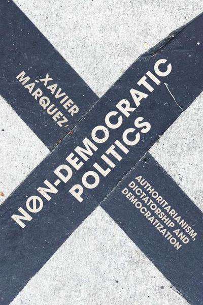
My new book, Non-Democratic Politics: Authoritarianism, Dictatorship, and Democratization has been out for a few weeks (Palgrave, Amazon). For the usual vaguely superstitious reasons, I did not want to make an announcement until I had a copy in my hands, but now I do. Just in time for the holidays!
Non-Democratic Politics Book Cover

I confess that I feel a bit ambivalent about the book’s publication. On the one hand, I’m of course glad the book is finally out in the wild; it’s been a long process, and it’s great to be able to touch and see the physical result of my work, and to know that at least some other people will read it. (Much better scholars of authoritarian politics than me also said some nice things about it in the back cover, which is extremely gratifying). Moreover, if you have followed this blog, you will find that some material in the book elaborates and supports many things I have said here more informally (on cults of personality, propaganda, robust action in the Franco regime, the history of political regimes, the Saudi monarchy, etc.); one reason I wrote the book was to be able to put together in a reasonably coherent way my thoughts on these subjects, and I felt encouraged enough by some of the reaction to my writing here to think that I had something to say. (Without this blog, this book probably would not exist; thank you readers!) And since I teach this material here at Vic, the result should be useful as a textbook. (If you teach classes on non-democratic politics do consider the book for use in your course!).

But I also feel that the book should be seen as “version 0.1” of what I really wanted to do. There was more that I wanted to write, and there are things I already want to add or revise (partly in response to current events, partly in response to learning new things), though I will only be able to do this if Palgrave decides there’s enough demand for a second edition. If I had more contractual leeway (and academic clout) I would put the whole thing in my Github repository and make it into an evolving work, adding or deleting material over time as I learn more, or correcting errors as they are brought to my attention, and releasing new versions every so often. But I don’t have that kind of leeway or clout yet (perhaps in the future – we’ll see); and traditional publication still offers some advantages (including dedicated peer review, from which I benefited a lot. Thank you, anonymous reviewers, whoever you are, for helping me improve this book).

In lieu of putting the entire work online, however, I have created a website where all the charts and data in the book are available, and where I can give free rein to my love of ggplot2 graphs and data art. The site (https://xmarquez.github.io/AuthoritarianismBook/) contains replication code for all the figures and tables in the book, natural-language explanations of the code, and full documentation for all the datasets, and is to boot available for download as a single R package. It also contains some extensions of the figures in the book, including huge vertical graphs of the kind that sometimes appear in this blog but could never fit in a normal book. My hope is that people can use this package (and the associated website) to easily do their own exploratory data analysis on the topic. I have tried to make it as user-friendly as possible for people with little experience using R; and I intend to update it regularly and add new features and corrections. Check it out![1]

The hardcover is unfortunately priced (I don’t recommend you buy it, unless you’re an academic library), and I think even the paperback should be cheaper, but I don’t make those decisions. Nevertheless, if you have enjoyed this blog in the past, and would like to see how many of the aspects of non-democratic politics I have discussed here fit together, or you simply wish to learn more about non-democratic politics, consider buying it!

Normal service on this blog will resume shortly.

  1. There will also be some further narrative material available at a different website, including extended discussions of a few cases, but I’m way behind on producing these narratives.

Thursday, March 24, 2016

Artisanal Democracy Data: A Quick and Easy Way of Extending the Unified Democracy Scores

(Apologies for the lack of posting - I've been finishing some big projects. This is of interest primarily to people who care about quantitative measures of democracy in the 19th century, or for some unknown reason enjoy creating latent variable indexes of democracy. Contains a very small amount of code, and references to more.)

If you have followed the graph-heavy posts in this blog, you may have noticed that I really like the Unified Democracy Scores developed by Daniel Pemstein, Stephen Meserve, and James Melton. The basic idea behind this particular measure of democracy, as they explain in their 2010 article, is as follows. Social scientists have developed a wealth of measures of democracy (some large-scale projects like the Polity dataset or the Freedom in the World index, some small “boutique” efforts by political scientists for a particular research project). Though these measures are typically highly correlated (usually in the 0.8-0.9 range), they still differ significantly for some countries and years. These differences are both conceptual (researchers disagree about the essential characteristics of democracy) and empirical (researchers disagree about whether a given country-year is democratic according to a particular definition).

PMM argue that we can assume that these measures are all getting at a latent trait that is only imperfectly observed and conceptualized by the compilers of all the datasets purporting to measure democracy, and that we can estimate this trait using techniques from item response theory that were originally developed to evaluate the performance of multiple graders in academic settings. They then proceeded to do just that, producing a dataset that not only contains latent variable estimates of democracy for 9850 country-years (200 unique countries), but also estimates of the measurement error associated with these scores (derived from the patterns of disagreement between different democracy measures).

This, to be honest, is one of the main attractions of the UDS for me: I get nervous when I see a measure of democracy that does not have a confidence interval around it, given the empirical and conceptual difficulties involved in producing numerical estimates of a woolly concept like “democracy.” Nevertheless, the UDS had some limitations: for one thing, they only went back to 1946, even though many existing measures of democracy contain information for earlier periods, and PMM never made use of all the publicly available measures of democracy in their construction of the scores, which meant that the standard errors around them were relatively large. (The original UDS used 10 different democracy measures for its construction; the current release uses 12, but I count more than 25).

Moreover, the UDS haven’t been updated since 2014 (and then only to 2012), and PMM seem to have moved on from the project. Pemstein, for example, is now involved with measurement at the V-Dem institute, whose “Varieties of Democracy” dataset promises to be the gold standard for democracy measurement, so I’m guessing the UDS will not receive many more updates, if any. (If you are engaged in serious empirical research on democracy, you should probably be using the V-dem dataset anyway. Seriously, it’s amazing - I may write a post about it later this year). And though in principle one could use PMM's procedure to update these scores, and they even made available an (undocumented) replication package in 2013, I was never able to make their software work properly, and their Bayesian algorithms for estimating the latent trait seemed anyway too computationally intensive for my time and budget.

I think this situation is a pity. For my own purposes – which have to do mostly with the history of political regimes for my current project – I’d like a summary measure of democracy that aggregates both empirical and conceptual uncertainty in a principled way for a very large number of countries, just like I believe the UDS did. But I also would like a measure that goes back as far as possible in time, and is easily updated when new information arises (e.g., there are new releases of Freedom House or Polity). The new V-dem indexes are great on some of these counts (they come with confidence intervals) but not on others (they only cover 2014-1900, they are missing some countries, and the full dataset is a bit unwieldy – too many choices distract me). Other datasets – the trusty Polity dataset, the new and excellent LIED index – do go back to the 19th century, but they provide no estimates of measurement error, and they make specific choices about conceptualization that I do not always agree with.

But why wait for others to create my preferred measure when I can do it myself? So I went ahead and figured out how to first replicate the Unified Democracy scores without using a computationally intensive Bayesian algorithm, and then extended them both forwards to 2015 and backwards to the 19th century (in some cases to the 18th century), using information from 28 different measures of democracy (some of them rather obscure, some just new, like the LIED index or the latest version of the Freedom House data). And I created an R package to let you do the same, should you wish to fiddle with the details of the scores or create your own version of the UDS using different source measures. (Democratizing democracy indexes since 2016!).

The gory details are all in this paper, which explains how to replicate and extend the scores, and contains plenty of diagnostic pictures of the result; but if you only want to see the code to produce the extended UDS scores check out the package vignette here. If you are an R user, you can easily install the package and its documentation by typing (assuming you have devtools installed, and that I’ve done everything correctly on my side):

devtools::install_github(repo = "xmarquez/QuickUDS")

The package includes both my “extended” UD scores (fully documented and covering 24111 country-years going all the way to the 18th century in some cases, for 224 sovereign countries and some non-sovereign territories) and a replication dataset which includes 61 different measures of democracy from 29 different measurement efforts covering a total of 24149 country-years (also fully documented). (Even if you are not interested in the UDS, original or extended, you may be interested in that dataset of democracy scores). For those poor benighted souls who use Stata or (God fobid) some awful thing like SPSS (kidding!), you can access a CSV version of the package datasets and a PDF version of their documentation here.

To be sure, for most research projects you probably don’t need this extended Unified Democracy measure. After all, most useful variables in your typical democracy regression are unmeasured or unavailable before the 1950s for most countries, and if your work only requires going back to the 1900s, you are better off with the new V-dem data, rather than this artisanal version of the UDS. But the extended UDS is nice for some things, I think.

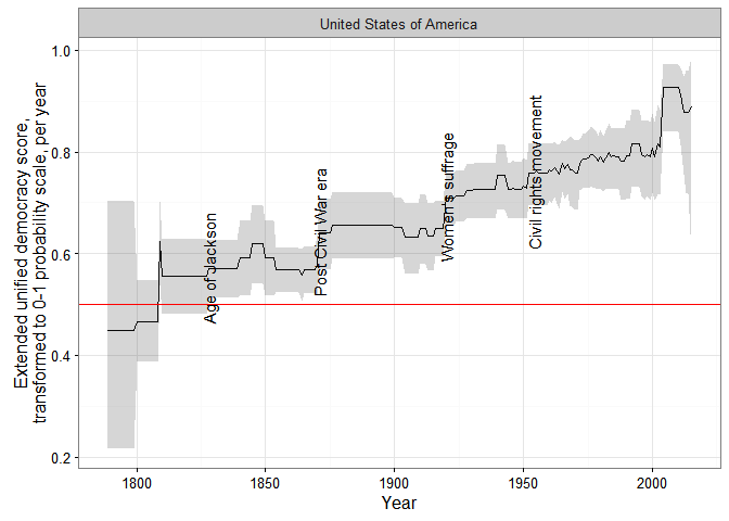
First, quantitative history (what I wanted the extended UDS for). For example, consider the problem of measuring democracy in the USA over the entirety of the last two centuries. Existing democracy measures disagree about when the USA first became fully democratic, primarily because they disagree about how much to weigh formal restrictions on women’s suffrage and the formal and informal disenfranchisement of African Americans in their conceptualization. Some measures give the USA the highest possible score early in the 19th century, others after the civil war, others only after 1920, with the introduction of women’s suffrage, and yet others (e.g. LIED) not until 1965, after the Civil Rights Movement. With the extended UDS these differences do not matter very much: as consensus among the different datasets increases, so does the measured US level of democracy:


In the figure above, I use a transformed version of the extended UDS scores whose midpoint is the “consensus” estimate of the cutoff between democracy and non-democracy among minimalist, dichotomous measures in the latent variable scale. (For details, see my paper; the grey areas represent 95% confidence intervals). This version can be interpreted as a probability scale: “1” means the country-year is almost certainly a democracy, “0” means it is almost certainly not a democracy, and “0.5” that it could be either. (Or we could arbitrarily decide that 0-0.33 means the country is likely an autocracy of whatever kind, 0.33-0.66 that it is likely some kind of hybrid regime, and 0.66-1 that is pretty much a democracy, at least by current scholarly standards).

In any case, the extended UDS shows an increase in the USA’s level of democracy in the 1820s (the “Age of Jackson”), the 1870s (after the civil war), the 1920s after female enfranchisement, and a gradual increase in the 1960s after the Civil Rights movement, though the magnitude of each increase (and of the standard error of the resulting score) depends on exactly which measures are used to construct the index. (The spike in the 2000s is an artifact of measurement, having more to do with the fact that lots of datasets end around that time than with any genuine but temporary increase in the USA’s democracy score). Some of these changes would be visible in other datasets, but no other measure would show them all; if you use Polity, for example, you would see a perfect score for the USA since 1871.

Just because what use is this blog if I cannot have a huge vertical visualization, here are ALL THE DEMOCRACY SCORES, alphabetically by country:

(Grey shaded areas represent 95% confidence intervals; blue shaded areas are periods where the country is either deemed to be a member of the system of states in the Gleditsch and Ward list of state system membership since 1816, i.e., independent, or is a microstate in Gleditsch’s tentative list).


A couple of things to note. First, scores are calculated for some countries for periods when they are not generally considered to be independent; this is because some of the underlying data used to produce them (e.g., the V-Dem dataset) produce measures of democracy for existing states when they were under imperial governance (see, e.g., the graphs for India or South Korea).

Second, confidence intervals vary quite a bit, primarily due to the number of measures of democracy available for particular country-years and the degree of their agreement. For some country-years they are so large (because too few datasets bother to produce a measure for a period, or the ones that do disagree radically) that the extended UD score is meaningless, but for most country-years (as I explain in my paper) the standard error of the scores is actually much smaller than the standard error of the “official” UDS, making the measure more useful for empirical research.

Finally, maybe this is just me, but in general the scores tend to capture my intuitions about movements in democracy levels well (which is unsurprising, since they are based on all existing scholarly measures of democracy); see the graphs for Chile or Venezuela, for example. And using these scores we can get a better sense of the magnitude of the historical shifts towards democracy in the last two centuries.

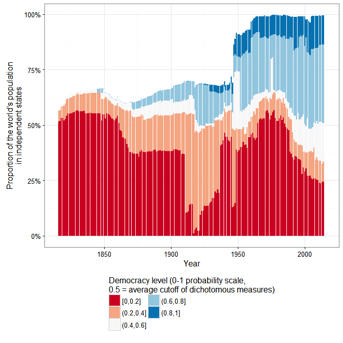
For example, according to the extended UDS (and ignoring measurement uncertainty, just because this is a blog), a good 50% of the world’s population today lives in countries that can be considered basically democratic, but only around 10% live in countries with the highest scores (0.8 and above):

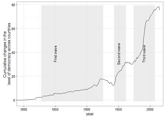
And Huntington’s three waves of democratization are clearly visible in the data (again ignoring measurement uncertainty):


But suppose you are not into quantitative history. There are still a couple of use cases where long-run, quantitative data about democracy with estimates of measurement error is likely to be useful. Consider, for example, the question of the democratic peace, or of the relationship between economic development and democracy – two questions that benefit from very long-run measures of democracy, especially measures that can be easily updated, like this one.

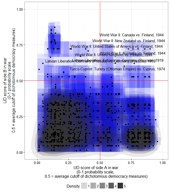
I may write more about this later, but here is an example about a couple of minor things this extended democracy measure might tell us about the basic stylized fact of the “democratic peace.” Using the revised list of interstate wars by Gleditsch, we can create a scatterplot of the mean extended UD score of each side in an interstate war, and calculate the 2-d density distribution of these scores while accounting for their measurement error:

The x- coordinate of each point is the mean extended UD score (in the 0-1 probability scale where 0.5 is the average cutoff between democracy and non-democracy among the most minimalistic measures) of side A in a war listed by Gleditsch; the y-coordinate is the mean extended UD score of side B; each blue square is the 95% “confidence rectangle” around these measures; the shaded blobs are the 2-d probability densities, accounting for measurement error in the scores.

As we can see, the basic stylized fact of a dyadic democratic peace is plausible enough, at least for countries which have a high probability of being democratic. In particular, countries whose mean extended UD democracy score is over 0.8 (in the transformed 0-1 scale) have not fought one another, even after accounting for measurement error. (Though they have fought plenty of wars with other countries, as the plot indicates). But note that the dyadic democratic peace only holds perfectly if we set the cutoff for “being a democracy” quite high (0.8 is in the top 10% of country-years in this large sample; few countries have ever been that democratic); as we go down to the 0.5 cutoff, exceptions accumulate (I’ve labeled some of them).

Anyway, I could go on; if you are interested in this “artisanal” democracy dataset (or in creating your own version of these scores), take a look at the paper, and use the package – and let me know if it works!

(Update 3/25/2016 - some small edits for clarity).

(Update 3/28 - fixed code error).

(Update 3/30 - re-released the code, and updated the graphs, to fix one small mistake with the replication data for the bnr variable).

(Code for this post is available here. Some of it depends on a package I’ve created but not shared yet, so you may not be able to replicate it all.)

Monday, December 21, 2015

Endnotes

Happy solstice, everyone!

It’s been a good year here at Abandoned Footnotes HQ. On the more academic side of things, three papers derived from ideas first discussed in this blog a long time ago are now in print (ungated copies here, here, and here, if anybody is interested enough). I may get around to saying more about them sometime next year. Plus, progress on other projects, and 11 posts on this blog!

The most viewed post was “The Saudi Monarchy as a Family Firm,” which won a 3QuarksDaily prize; the runner up was “Propaganda as Signaling.” The graph-heavy posts (modernist art masquerading as social science?) were also widely shared. Thanks to everyone who read, commented on and shared them!

As is the tradition here, here are a few things for your reading pleasure:
Happy summer solstice / winter solstice / christmas / festivus / yule / Newtonmass / Toxcatl or any other ritual you may celebrate to all!

Friday, December 04, 2015

The King's Two Bodies in Bolshevik Political Thought

I recently finished Nina Tumarkin’s fantastic book Lenin Lives! The Lenin Cult in Soviet Russia, which is totally up my alley, as you may imagine. (Why hadn’t I heard of this book before? It’s so good!). One really interesting point that comes up in her book is the development, alongside the actual rituals of the cult, of what we might call a “theory of representation” to justify a phenomenon (Lenin worship) that was prima facie contrary to the tenets of Marxism (and even to Lenin’s own wishes). And it struck me that this spontaneously developed and unsystematic “political theology” (to use a more pretentious term) was strikingly similar to the medieval doctrine of “the King’s two bodies.”

The idea of the King’s two bodies is in principle quite simple: the King’s authority does not come from any of his actual personal qualities, but from his personification of the “body politic,” to which his natural body is joined. Kantorowicz (in a famous book) traces this view to its roots in the relationship between the incarnate body of Christ and the Church as a “body” of believers, though this is not particularly important for our purposes here. A passage from Plowden’s Reports gives the gist of the view as it was understood by the jurists and lawyers of the Tudor period:
For the King has in him two Bodies, viz., a Body natural, and a Body politic. His Body natural (if it be considered in itself) is a Body mortal, subject to all Infirmities that come by Nature or Accident, to the Imbecility of Infancy or old Age, and to the like Defects that happen to the natural Bodies of other People. But his Body politic is a Body that cannot be seen or handled, consisting of Policy and Government, and constituted for the Direction of the People, and the Management of the public weal, and this Body is utterly void of Infancy, and old Age, and other natural Defects and Imbecilities, which the Body natural is subject to, and for this Cause, what the King does in his Body politic, cannot be invalidated or frustrated by any Disability in his natural Body (p. 7)
We might say that the king “represents” the state (makes it present) by personifying it physically; despite the fact that Louis XIV never actually said “L’Etat, c’est moi,” it is the sort of thing that would have made sense for him to say, as it summarizes this view quite well. And in personifying the state, the king’s “natural body” is in a sense “wiped clean,” gaining a kind of grace (“charisma”). To use Max Weber’s terminology, the “charismatic authority” of the king – his authority in virtue of the kind of person he is – thus becomes “routinized” , no longer dependent on his actual personal qualities but merely on his possession of an office. Yet it still remains a form of personal authority: loyalty and obedience is owed to the actual person of the king, not simply or solely to the abstract body of laws, the state, or the constitution, and the body of the king has a special majesty that must be honored.

Now, the early Bolsheviks would certainly have thought this was all nonsense. Yet the circumstances of the revolution, and in particular the obvious appeal of “charismatic” justifications for authority, seem to have forced them to try to accommodate such claims in ways that ended up being structurally quite similar.

The early Bolsheviks were rather “voluntaristic” by Marxist standards: they did not believe in merely sitting still and waiting for the dialectic of history to work its revolutionary magic. Yet most of them were wary of “heroes,” good Marxists that they were (unlike, say, the members of the Socialist Revolutionary party). Lenin’s What is to be Done exalted the role of the vanguard party of professional revolutionaries in the revolutionary process, not the role of any individual leader. And though his enormous energy, clear tactical judgment, and unshakable faith in the triumph of his vision, generated a form of charisma, as evidenced in a number of testimonies from both friends and enemies, he disliked flattery and did not seem to have consciously exploited his talent for “social hypnotism” to personalize state power.[1] Other charismatic Bolsheviks (Trotsky, for example) also preferred to exalt the party rather than themselves.

Yet soon after the October revolution it became clear that “charismatic” appeals were exceedingly useful in the struggle for the loyalty of the masses. Already in early 1918 the old Bolshevik M. S. Olminsky argued that though “[t]he cult of personality contradicts the whole spirit of Marxism, the spirit of scientific socialism,” Bolsheviks should not ignore their leaders, who personified the party and the working class (Tumarkin, p. 87). Individual Bolsheviks – primarily, but not exclusively, top leaders like Lenin – were both exemplars of the values that a good Communist should have (and thus to be emulated) and personifications of the proletariat (and thus to be honored). Lenin himself, for all his dislike of flattery, was quite conscious of the power of his image, and grudgingly accepted some of the manifestations of the cult growing around him. As Tumarkin puts it:
Lenin’s passive acceptance of publicity doubtless was partly inspired by his perception of the effectiveness of his image in legitimizing the new regime and in publicizing it. As Lunacharsky once observed, “I think that Lenin, who could not abide the personality cult, who rejected it in every possible way, in later years understood and forgave us” … [Lenin] was not ambivalent about playing the role of exemplar, as he did on May Day 1919 when he had worked in the Kremlin courtyard on the first subbotnik (p. 105) [2]
The cult of Lenin thus grew inexorably, even in the face of Lenin’s personal resistance, from the perception that the values and aspirations of the Bolshevik party were credibly embodied in his person. Charismatic claims to authority may have been suspect from a theoretical point of view, but they seem to have worked in practice. Yet in order to account for them the Bolsheviks were forced to insist that the veneration of Lenin and other leaders was acceptable because the leader always symbolized and represented, in a heightened degree, the party and the proletariat; to glorify Lenin was thus not to venerate the “hero” as such, but the proletariat itself, even though the “mortal” body of Lenin was connected to his “symbolic” body.

Possibly the most striking example of this thesis of “Lenin’s two bodies” appears in a piece written when Lenin was shot by SR member Fanya Kaplan in August 1918. At the time, Bolshevik journalist Lev Sosnovsky (who was to become the head of the Central Committee’s Agitprop department in 1920) wrote in Bednota, a newspaper “aimed at the broad mass of peasant readers” that:
Lenin cannot be killed … Because Lenin is the rising up of the oppressed. Lenin is the fight to the end, to final victory … So long as the proletariat lives – Lenin lives. Of course, we, his students and colleagues, were shaken by the terrible news of the attempt on the life of dear ‘Ilich’, as the communists lovingly call him … A thousand times [we] tried to convince him to take even the most basic security precaurions. But ‘Ilich’ always rejected these pleas. Daily, without any protection, he went to all sorts of gatherings, congresses, meetings (pp. 83-84)
Tumarkin comments that in Sosnovsky’s presentation, “Ilich is the mortal man and Lenin is the immortal leader and universal symbol … The mortal man exposed himself to danger, but Lenin cannot be killed.” Yet this piece is not an isolated case, explainable perhaps by Sosnovsky’s attempt to appeal to peasant readers. The futurist poet Vladimir Mayakovsky, for example, well aware of the problematic nature of leader cults within Marxist thought, nevertheless justified the veneration of Lenin in terms similar to Sosnovsky’s, writing on the occasion of Lenin’s fiftieth birthday (1920):
I know –
It is not the hero
Who precipitates the flow of revolution.
The story of heroes –
is the nonsense of the intelligentsia!
But who can restrain himself
and not sing
of the glory of Ilich? …
Kindling the lands with fire
everywhere,
where people are imprisoned,
like a bomb
the name
explodes:
Lenin!
Lenin!
Lenin! …
I glorify
in Lenin
world faith
and glorify
my faith (p. 100)
Mayakovsky hits on the crucial point: to glorify Lenin is to glorify the values of his party because Lenin represents more than the mere mortal Ilich; he represents, as another writer put it in a piece published on the sixth anniversary of the revolution, “a program and a tactic … a philosophical world view … the ardent hatred of oppression … the rule of pure reason … a limitless enthusiasm for science and technology … the dynamic and the dialectic of the proletariat;” in sum, “Lenin is the one Communist Party of the Red Globe” (p. 132).

In these last couple of passages, Lenin is glorified primarily as a symbol – of the party, the revolution, and the proletariat. But the physical body still mattered; the embodiment of Lenin as Ilich was not irrelevant to his symbolic effectiveness. As Tumarkin notes, both in 1918 (when Lenin was shot) and in 1923 (when he died) the party press had presented Lenin as a sort of physical superman, surviving physical harm that would have killed a lesser man (p. 171); the natural body of the king, joined to his spiritual body, is no longer an ordinary body. And of course, the significance of Lenin’s natural body emerges most clearly in the fantastically strange decision (from a Marxist point of view) to embalm it and put it on public display after his death.

It is not clear, at least at the time Tumarkin was writing (1980s), how the ultimate decision to embalm was made; she suggests that Stalin was the driving force, since he had insisted that Lenin be buried “in the Russian manner” rather than cremated in the “modern” manner. (Cremation was apparently associated with executed prisoners in Russia, and Stalin seems to have been concerned about the bad symbolic connotations of doing this to Lenin). It certainly seems to have been controversial: Trotsky, Bukharin, and Kamenev all opposed it – Trotsky specifically objecting to turning Lenin into an Orthodox icon. So did Lenin’s secretary, Bonch-Bruevich, and Nadezhda Krupskaia (Lenin’s wife) protested publicly when the decision was revealed. The obvious similarities between the worship of the saints in Orthodox Christianity (whose bodies, if they are truly saintly, are not supposed to decay) and the proposal to mummify and exhibit Lenin’s body must have discomfited many “good Bolsheviks.”

But some of the people involved, like Leonid Krasin, had belonged to the “God-building” movement within Bolshevism, which we could call the transhumanist wing of the Bolsheviks. (Tumarkin tells some fabulous stories about them – both Gorky and Lunacharsky, the latter the first “Commissar of Enlightment” were also affiliated with this current of thought). They believed in the power of science (including Marxism, which they saw as the most important part of science) to eventually to overcome death itself, and saw themselves as consciously engaged in the creation of a new divinity. Krasin even “publicly preached his belief in the [physical] resurrection of the dead” through science, and speculated on the potential of cryonics to preserve the dead until the time “when one will be able to use the elements of a person’s life to recreate the physical person.” (Bolshevik EMs!). For them, the “immortalization of Lenin was a true deification of man.”

By showing that they could preserve Lenin’s body from corruption, they also seem to have hoped to create a proper sort of communist Saint, whose undecaying body was due to science rather than to God, and thus to help weaken an Orthodox Christianity widely believed by the population. As one of the people involved in the project (Boris Zbarsky) put it after the embalming:
The Russian Church had claimed that it was a miracle that its saints’ bodies endured and were incorruptible. But we have performed a feat unknown to modern science … We worked four months and we used certain chemicals known to science [though the chemicals remained secret - the lore of embalming was among the arcana imperii in the Soviet Union]. There is nothing miraculous about it (p. 196).
Nevertheless, proponents of embalming (the members of the aptly-named “Immortalization Commission”) still had to justify the decision to skeptical Bolsheviks in terms that clearly distinguished between the veneration of Orthodox Saints and the “new” veneration of Lenin. And the best they could come up with was generally some variation on the theme that the physical body of Lenin would provide genuine happiness to future generations. (I am reminded here of Mao’s mangoes). Here’s Avel Enukidze:
It is obvious that neither we nor our comrades wanted to make out of the remains of Vladimir Ilich any kind of “relic” (moshchi) by means of which we would have been able to popularize or preserve the memory of Vladimir Ilich. With his brilliant writings and revolutionary activities, which he left as a legacy to the entire world revolutionary movement, he immortalized himself enough.
[…]
We wanted to preserve the body of Vladimir Ilich, not in order simply to popularize his name, but we attached and [now] attach enormous importance to the preservation of the physical features of this wonderful leader, for the generation that is growing up, and for future generations, and also for the hundreds of thousands and maybe even millions of people who will be supremely happy to see the physical features of this person (p. 188).
I’m not arguing that the physical body of Lenin was actually useful as a mobilization device. There is little evidence that people came to the Lenin mausoleum for “spiritual” reasons, or that they experienced great “happiness” upon seeing Lenin – more likely, as Tumarkin argues, they came “out of a combined sense of political duty and fascination, or even morbid curiosity” (p. 197). But at the end of the day, leading Bolsheviks felt strongly that Lenin’s body needed to be preserved; to them the physical body of Lenin was inextricably tied to his symbolic and representative function. It became a “fetish” in the technical Marxist sense of the word.

It is tempting to dismiss these things as the result of sheer “flattery inflation.” But while flattery inflation was certainly going on (Tumarkin tells some very humorous anecdotes about that), the Bolsheviks still needed to come up with a theory of representation to justify the veneration of Lenin, whether mostly spontaneous (as in the aftermath of Lenin’s shooting in 1918) or more orchestrated (as in the aftermath of Lenin’s death in 1923). For all the bad faith required (since almost everyone agreed that ruler veneration was a feudal practice that had no place in a Marxist state), this theory remained remarkably consistent from Lenin to Stalin and even beyond Stalin, after Khrushchev denounced the “cult of personality” in the famous “Secret Speech” to the 20th Party Congress. Even Stalin, whose cult was, to put it somewhat uncharitably, basically a cynical ploy to concentrate power, felt the need to indicate that the veneration of “Stalin” was not the veneration of the mortal Iosif Vissarionovich Dzhugashvili, but the glorification of the Soviet state. There’s a funny anecdote Jan Plamper retells in his book on the Stalin cult that shows how seriously Stalin took this idea:
Artyom Sergeev, Stalin’s adopted son, was also fond of telling a story. He recalled a fight between Stalin and his biological son Vasily. After he found out that Vasily had used his famous last name to escape punishment for one of his drunken debauches, Stalin screamed at him. ‘But I’m a Stalin too,’ retorted Vasily. ‘No, you’re not,’ said Stalin. `You’re not Stalin and I’m not Stalin. Stalin is Soviet power. Stalin is what he is in the newspapers and the portraits, not you, not even me! (Plamper, The Stalin Cult, p. xiii)
Stalin could be venerated and respected because “Stalin” did not refer to the king’s mortal body, with all its failings, but to his representative function. To be sure, Stalin’s drive towards “totalization” – to paraphrase Mussolini, “all within Soviet power, nothing outside Soviet power, nothing against Soviet power” – meant that perhaps unlike Lenin, Stalin had to represent everything. As Tumarkin puts it, “Lenin was … like a Greek or Roman god who was master in only one field of activity” while “Stalin in the heyday of his personality cult wished to be recognized as superlative in everything - philosophy, linguistics, military strategy - like an omniscient deity” (p. 60). As the power of the state expanded, so did the domain of charismatic representation.

I suspect a similar theory of representation developed in China after Khrushchev’s denunciation of the cult of personality in Russia prompted some soul-searching about the cult of Mao within the Chinese Communist Party (as I noted here). In China, the distinction between the “correct” cult of truth (geren chongbai 个人 崇拜) and the “incorrect” veneration of mere persons (geren mixin 个人 è¿·ä¿¡), however transparently driven by Mao’s desire to concentrate power, remained within the orbit of a (non-Marxist) theory of representation that derived the charismatic claim to authority from the credibility of the leader’s claim to symbolize the truth of the Chinese revolution. And yet, as in Russia, the actual physical body of the ruler mattered; the ruler was never purely an abstract symbol. Mao the superhuman swimmer, Mao’s mangoes, Mao’s physical appearance - they were all infused by Mao the truth of the revolution.

Perhaps I’m making too much of this. But it strikes me that the independent Communist reinvention of medieval theories of representation as a way to accommodate “charismatic” claims to authority (real or fake - it doesn’t matter), despite the obvious theoretical inconsistency between leader worship and classical Marxism, is indicative of a broader problematic of modern politics in a democratic age. Put bluntly, all mass politics is symbolic politics (whether in democratic or non-democratic contexts); and thus what we might call the “charismatic temptation” – the temptation to grant authority to a person who embodies these symbols, rather than to the law, or the constitution – remains ever present.
  1. The phrase “social hypnotism” is from a short description of Lenin by one B. Gorev, published in a 1922 Komsomol anthology of propaganda writings, quoted by Tumarkin (p. 130).
  2. The subbotnik was a Russian revolutionary way of celebrating May Day by offering “voluntary” labor. Lenin famously participated in the first subbotnik in the Kremlin by doing some heavy labor, which gained him the admiration of the workers present (and a lot of positive publicity). Incidentally, Tumarkin gives the date of the first subbotnik in which Lenin participated as May Day 1919; other sources give its date as May Day 1920.

Thursday, October 15, 2015

Free Market Cults

(Warning: not about Steve Jobs, or about modern economics).

I have a post at the Monkey Cage on Putin’s recent prowess at the hockey rink and the sometimes dubious sports and artistic achievements of political leaders that may interest regular readers of this blog. (I am not responsible for the search engine-optimized headline, though I am responsible for all errors). In order to write it, I took the opportunity to read a neat collection of essays edited by Helena Goscilo, Putin as Celebrity and Cultural Icon, which includes an updated version of an earlier paper by Julie Cassiday and Emily Johnson on what they call “Putiniana”: the weird and wonderful world of Putin-themed products.

These range from the sorts of things that would not be out of place in any normal electoral campaign (e.g., Putin-themed party balloons) to the weird and wonderful: chocolate portraits of Putin, stuffed bunnies that sing a pop song proclaiming love for Putin, a 2010 lingerie calendar where Moscow State University students express their love for Putin, and “dental flossers in packets with the President’s portrait emblazoned on the front.” There are DVDs that fictionalize Putin’s love life, and even a small subgenre of fanfiction novels (some apparently quite popular) that cast Putin as a hero, such as Aleksandr Ol’bik’s President, which begins as follows:
It’s the hot summer of 2001 […] Events develop swiftly and completely unexpectedly. The President decides to head out for Chechnia with a spetsnaz squad to destroy the rebels’ lair […] He does this and is the only one left alive. (Putin as Celebrity and Cultural Icon, Kindle loc. 1169-1171).
And then there are “objets d’art” :
One key point to note about this sort of stuff (and about similar products elsewhere, like Chavez paraphernalia – I’m sure readers can come up with fun examples from all sorts of places, including American electoral campaigns) is that it is produced and sold in a reasonably free market. (Some of it is, of course, given away, but much is actually sold for profit). The weirdest Putiniana is not produced at the behest of the Kremlin, and though it is sometimes disavowed by it, it has not attempted to suppress it. Moreover, while some of the most over-the-top stuff is clearly satirical in intent (such as the “Superputin” webcomic; in English here), some of it is bought or consumed by people who support Putin and approve of his supermacho image. (Though I remain baffled about who could possibly want to buy some of the more expensive objects, like a $700 limited edition chocolate Putin (measuring 12” by 19”) produced in 2003).

That people will buy the paraphernalia of leader cults is not a matter of course, even when they are constantly barraged by propaganda and pressured by authorities to do so. For example, from Alexey Tikhomirov’s wonderful piece on the “symbols of power” in the GDR before 1961, we learn that early attempts to sell Soviet leader paraphernalia in East Germany were almost a complete failure:
The establishment of a planned socialist economy, with the organized production of party cult objects, heightened the intensity with which public space was saturated with the symbols of power. The party put in orders for such items and created a centralized system to sell them. A catalogue of objects with political symbolism was published in 1949. It offered consumers an assortment of busts, reliefs, posters, portraits, postcards, and badges with images of the “leaders of the workers’ movement.” As a rule, these objects were churned out on East German soil, using Soviet models, and then distributed, with monitoring from above, to mass organizations, party organs, the army, schools, and universities. Attempts to organize retail sales of personality cult objects were not successful. Consumer demand for these things was virtually nil. Thus the owner of a small store in Leipzig that sold pictures of various types admitted that almost no one was interested in portraits of Stalin, Lenin, Marx, and Pieck. The employees of the Soviet military administration, however, were some of the most enthusiastic buyers of “pictures that were artistically kitschy.” (p. 60; emphasis added).
The desire (or the need) to buy such objects in particular contexts will of course vary with how much people feel the need to signal identification with a leader, to conform to social pressure, and the like. Yet (at least in Russia or Venezuela today) the market for such objects is indifferent to the meaning people give them; whether people bought, for example, the 2004 stuffed bunnies that sang “someone like Putin” to show how much they cared for Putin, or because they thought they were funny, or because they were hipsters wanting to show their ironic detachment from dominant values, or because they wanted to show their friends how ridiculous they were, matters not at all to whether or not they are sold. And, as Cassiday and Johnson note, most Russians – not just people who are dissatisfied with Putin – do not take Putiniana entirely seriously; to the extent that there is something like a personality cult here (perhaps because the market is large and robust, and supports a wide variety of such products?) it is not because the meaning people attribute to these objects and stories is clear and unambiguous. In fact, it seems to me that trying to “read” the meaning of a leader cult from the fact that, say, dental floss emblazoned with a picture of Putin is produced seems to me to be a fool’s errand; under reasonably free market conditions, there is no single meaning that is even intended, much less perceived, in the many manifestations of a leader’s image, nor any way to tell directly how people think of the leader, even if they approve of him (as seems reasonably clear in the case of Putin).

Friday, September 11, 2015

The Futility of Propaganda

When asked, “What do you know about Yugoslavia?” the peasant, painstaking and placid, answered, “It is a pseudosocialist country run by revisionist hyenas in the pay of American capitalism.”
Somewhat later, the interviewer asked: “If you could choose, where would you like to live?”
“Well, in Yugoslavia, for example”
“Why?”
“It seems that in pseudosocialist countries run by revisionist hyenas in the pay of American capitalism, oil and cotton cloth are not rationed.”
From an interview, sometime in the early 1960s, of a Chinese peasant who had fled to Hong Kong from the People’s Republic of China. Found in Simon Leys, Chinese Shadows, p. 52.

Friday, August 28, 2015

The Mismeasure of Growth

About six months ago, Tom Pepinsky wrote a post, on the occasion of Lee Kuan Yew’s death, where he argued graphically that Lee Kuan Yew’s claim to have taken Singapore “from Third World to First” was a bit overstated. (Yes, I’m posting about this six months later - but I have never claimed that this blog offers hot takes on the news!). Using Kristian Gleditsch’s expanded GDP data, he noted that, in percentile terms, Singapore was already quite wealthy by the time it became independent, especially when compared to its neighbours:

By this measure, Singapore was as wealthy as the UK (per capita) by the mid-1970s, not because it had grown especially fast, but because it had started from a relatively high base. On this view, the most we could say is that Singapore escaped the “middle income trap,” not so much the “third world.”

The post got a fair bit of attention, though also, as I recall, a bit of pushback on Twitter and in the comments about both the data source used (Gleditsch rather than the Penn World Table or the Maddison dataset) and the decision to look at the percentile rank of income rather than the actual per capita income. Indeed, the figure above looks different if we use the Penn World Table’s latest measure of “expenditure side real GDP, at chained PPPs” (recommended by the Penn World Table investigators for “comparison of living standards across countries and over time”):

(There’s no data for Myanmar in the PWT 8.1).

Now Singapore’s starting income rank is much closer to Malaysia’s (they were, after all, part of the same country until 1965), solidly in the middle, and does not reach the UK’s income rank until the 1990s, instead of the 1970s. The difference between the two graphs is even starker if, instead of percentile ranks, we simply look at the actual income per capita numbers in PWT8.1 vs the Gleditsch data:

Using the recommended PWT 8.1 measure, Singapore at independence in 1965 had a per capita income of around $3,000 per capita, only a bit higher than Malaysia’s, and only one-sixth of US income; using the Gleditsch data, by contrast, Singapore starts out at nearly double the income level of Malaysia (more than $6000 compared with around $3,500), about a third of US income (and about half of UK income). It’s a big head-start, and it does make Lee’s achievement look a bit less impressive (an average growth rate for the period 1965-1990, when Lee was Prime Minister, of 4.8% rather than 6.9% per year for the PWT8.1 measure). At the time, I thought that the difference between the two estimates of Singaporean GDP was simply a matter of different data sources. But when you dig deeper, it turns out that the source of Gleditsch’s numbers for Singapore was … the Penn World Table (version 8.0)!

What is going on here? In this particular case, the discrepancy is due, first, to adjustments in the 2005 PPPs used between versions 8.0 and 8.1 of the PWT that increased the base price level in many countries and years, and hence lowered their measured GDP, and second, to the fact that the Gleditsch data reports, not the “expenditure side” measure of GDP (basically real GDP adjusted for changes in the terms of trade), but the measure for “output side real GDP at chained PPPs” (which is not adjusted for terms of trade). The latter measure, according to the PWT’s handy guide, is the one that should be used “to compare relative productive capacity across countries and over time,” rather than living standards (which may be affected by favourable terms of trade - e.g., unusually low import prices or unusually high export prices).1 The combined effect of these two differences makes Singapore’s economic performance look less impressive on the Gleditsch measure (PWT 8.0) than on the PWT8.1’s “expenditure side” measure (or even the PWT8.1’s “output side” measure):

Indeed, the estimated growth rates for the period of Lee’s premiership of independent Singapore (1965-1990),2 according to all the different datasets available (Penn World Table 8.0, Penn World Table 8.1, World Development Indicators, Gleditsch, Maddison) do vary a fair amount:

(I include a measure from PWT8.1 for “real consumption of households and government, current PPPs,” which is also used to compare growth in living standards, according to this PWT document. Error bars can be understood as a measure of volatility in the GDP measure - larger bars indicate more ups and downs in the series). To be sure, by whatever measure, Singapore under Lee Kuan Yew grew very fast compared to the rest of the world (certainly in the top 10% of all countries for the period 1965-1990, sometimes appearing as the top performer overall), though it was not among the ranks of the ultra-poor when it started (the low-end estimate of around $3,000 per capita in 1965 may not be rich, but it’s three times the estimated per capita GDP of China in 1965 for the same measure). But purely by accident, the Gleditsch data shows Lee in the worst possible light:

Measure Growth rate Percentile Rank
PWT 8.1: Output side, chained PPPs 7.25% 100 1 out of 57
PWT 8.1: Output side, current PPPs, 2005$ 7.21% 100 1 out of 57
PWT 8.1: Expenditure side, current PPPs, 2005$ 7.03% 100 1 out of 57
PWT 8.1: Expenditure side, chained PPPs 6.89% 100 1 out of 57
WDI: GDP per capita, constant 2005$ 6.63% 100 1 out of 42
Maddison 2013: Real GDP per capita, 1990$ 6.38% 99 2 out of 80
PWT 8.0: Expenditure side, current PPPs, 2005$ 7.01% 98 2 out of 57
PWT 8.0: Expenditure side, chained PPPs 6.88% 98 2 out of 57
PWT 8.0: Output side, current PPPs, 2005$ 6.86% 98 2 out of 57
PWT 8.1: National-accounts growth rates, 2005$ 6.65% 98 2 out of 57
PWT 8.0: National-accounts growth rates, 2005$ 6.65% 98 2 out of 57
PWT 8.1: Real consumption of households and government, current PPPs, 2005$ 5.00% 93 5 out of 57
PWT 8.0: Output side, chained PPPs 4.83% 91 6 out of 57
Gleditsch 4.83% 91 8 out of 83

There are perfectly good reasons for this variation in growth estimates. Current PPP measures of GDP per capita should not, in general, be identical to chained PPP measures, since the PPP conversion factors will vary over time in the latter and not in the former; I assume that this divergence may be magnified when an economy is undergoing genuine structural transformation. Expenditure-side and output-side measures will also vary depending on whether a country is facing better or worse terms of trade, something that will apply especially to trade-dependent economies like Singapore’s.

More generally, the Maddison project, the World Bank, and the Penn World Table project make different adjustments to the numbers produced by national statistical offices, based on different views about how to compare various prices across countries and time and different assumptions about the structure of particular economies. And though in the Singaporean case this is not really a problem, ultimately most estimates of the productive capacity of an economy, or the living standards of a country, depend on the reliability of national statistical agencies, which are subject to different constraints, including lack of resources to gather data and political manipulation. Morten Jerven, for example, argues that in some African countries, the numbers measuring GDP are basically guesstimates of limited value, given the lack of reliable price surveys, the low capacity of some national statistical offices, and the impossibility of measuring certain economic sectors; and Jerome Wallace has written on the political incentives for manipulating GDP statistics in China, especially at the subnational level, which bias Chinese growth rates upwards. (Estimates of Chinese GDP in particular are currently controversial. Though the main PWT data reports estimates of the Chinese economy based on official national accounts data, the PWT researchers also provide an additional table reporting “adjusted” national accounts data based on the research of Harry Wu. The Maddison project reports the Wu-adjusted data instead, which results in generally lower rates of growth before 1990 than the official data).

How much does it matter, however, which measure we use to evaluate the economic performance of particular regimes and political leaders? Which leaders and regimes have the most “disputed” economic performance, depending on the measure used? Using the Beta version of the Archigos dataset, I estimated the growth rates of all available measures of GDP per capita for all political leaders who were in office by at least 8 years up until 2014 in the post-1945 period. Eight years may not seem long, but in fact only about 15% of all leaders survive that long in power, so this is a pretty select group of “political survivors.” Moreover, eight years is two American presidential terms (so the data includes some American leaders), and seems long enough for leaders to actually make a difference, or at least successfully ride out a crisis or two. The economic stars of this select group of about 350 politically over-achieving group of leaders presided over estimated growth rates greater than 90% of all other countries with data for the period in which they were in office (averaging all growth rate estimates from the different datasets):

The variation at the top is enormous, depending on what measure we use. For example, Obasanjo is ranked as the top performing leader from 1999-2007 on many of the PWT8.1 measures, but only in the 84th percentile according to Maddison, and the estimated growth rates for the period range all the way from 6.7% per year (Maddison) to 28% per year (PWT 8.1, growth in consumption). If we believe the PWT, Obasanjo presided over a seven-fold increase in Nigeria’s living standards; if we believe Maddison (or the WDI), Nigerian living standards merely increased by about 1.7 times during his time in office. The economic performance of other leaders varies even more dramatically: if we believe version 8.1 of the PWT, the real consumtion of households and government in Equatorial Guinea under Teodoro Obiang Nguema Mbasogo increased about 6 times from 1979-2014; if we believe the GDP per capita measures on the expenditure side in both versions of the PWT, living standards increased about 45 times; and if we believe the output-side measure from the PWT version 8.0, the productive capacity of the economy of Equatorial Guinea increased about 125 times, more than under any other leader in this dataset. A real benefactor! (Right). In this context, it is reassuring that almost all measures agree that Singapore’s productive capacity and measured living standards increased by around five times during Lee’s time in office.

The same variability is also evident among the very worst performers:

Depending on which measure you use, Nigeria’s economic output and living standards under the military government of Babangida either contracted at a rate of around 17% per year (PWT8.1, expenditure-side measures), or merely remained stagnant (Maddison, World Development indicators). Jabir as-Sabah of Kuwait presided over one of the most severe depressions in modern history (-15% per year for 12 years, output-side measure in PWT 8.0) or merely over an extended recession caused by falling oil prices (-1.3% per year, real consumption measure from PWT 8.1). In the case of Syria under Hafiz al-Assad, the different datasets do not even agree as to whether the economy was growing a bit or shrinking horribly during his time in power.

The problem is not that some datasets always produce higher or lower estimates, but that for some particular kinds of leaders and countries, they seem to disagree for opaque reasons. The biggest divergences in estimates seem to occur for leaders that presided over states whose statistical capacity is at best dubious, or who were undergoing some severe trade shock (wild swings in the price of oil, or severe conflict or civil war), but it’s hard to tell without more detailed analysis. (By contrast, estimates of growth rates in the “advanced” economies of Europe and the USA typically agree across all measures). Here, for example, are the leaders whose growth estimates differ the most (90th percentile and above) when measured in more than two different ways by two or more different datasets, as well as the sources of the high and low estimates:

Leader Lowest Highest Difference Source low Source high Measures
Obasanjo, Nigeria, 1999-2007 6.8% 28.2% 21.43 Maddison 2013: Real GDP per capita, 1990$ PWT 8.1: Real consumption of households and government, current PPPs, 2005$ 15
Babangida, Nigeria, 1985-1993 -18.0% 0.9% 18.84 PWT 8.1: Real consumption of households and government, current PPPs, 2005$ Maddison 2013: Real GDP per capita, 1990$ 14
Emile Lahoud, Lebanon, 1998-2007 0.0% 14.5% 14.45 WDI: GDP per capita, constant 2005$ PWT 8.1: Output side, chained PPPs 15
Jabir As-Sabah, Kuwait, 1978-1990 -14.6% -1.3% 13.28 PWT 8.0: Output side, chained PPPs PWT 8.1: Real consumption of households and government, current PPPs, 2005$ 13
Amad Al Thani, Qatar, 1995-2007 2.8% 15.8% 12.96 Maddison 2013: Real GDP per capita, 1990$ PWT 8.1: Expenditure side, current PPPs, 2005$ 13
Bashar al-Assad, Syria, 2000-2011 1.4% 13.3% 11.87 Maddison 2013: Real GDP per capita, 1990$ PWT 8.1: Real consumption of households and government, current PPPs, 2005$ 13
Bagabandi, Mongolia, 1997-2005 -0.6% 9.9% 10.49 Maddison 2013: Real GDP per capita, 1990$ PWT 8.1: Expenditure side, current PPPs, 2005$ 15
Hun Sen, Cambodia (Kampuchea), 1985-1993 -4.3% 5.4% 9.67 Gleditsch, from Maddison, PWT8.0 PWT 8.0: Output side, current PPPs, 2005$ 13
Nguema Mbasogo, Equatorial Guinea, 1979-2014 5.3% 14.8% 9.52 PWT 8.1: Real consumption of households and government, current PPPs, 2005$ PWT 8.0: Output side, current PPPs, 2005$ 12
Saddam Hussein, Iraq, 1979-2003 -8.6% 0.9% 9.45 Maddison 2013: Real GDP per capita, 1990$ PWT 8.1: Real consumption of households and government, current PPPs, 2005$ 14
H. Aliyev, Azerbaijan, 1993-2003 -5.2% 3.9% 9.04 PWT 8.1: Real consumption of households and government, current PPPs, 2005$ WDI: GDP per capita, PPP, constant 2005$ 15
Hun Sen, Cambodia (Kampuchea), 1997-2014 -0.8% 7.9% 8.64 Gleditsch, from Maddison, PWT8.0 PWT 8.0: Expenditure side, current PPPs, 2005$ 14
Elias Hrawi, Lebanon, 1989-1998 -1.5% 6.8% 8.28 PWT 8.1: Output side, chained PPPs WDI: GDP per capita, constant 2005$ 14
Menem, Argentina, 1988-1999 2.8% 10.9% 8.13 Maddison 2013: Real GDP per capita, 1990$ PWT 8.1: Expenditure side, chained PPPs 14
Khatami, Iran (Persia), 1997-2005 3.5% 11.4% 7.99 WDI: GDP per capita, constant 2005$ PWT 8.1: Expenditure side, current PPPs, 2005$ 15
Akayev, Kyrgyz Republic, 1991-2005 -8.1% -0.2% 7.92 PWT 8.1: Expenditure side, chained PPPs Maddison 2013: Real GDP per capita, 1990$ 15
Yeltsin, Russia (Soviet Union), 1991-1999 -13.2% -5.3% 7.91 PWT 8.1: Output side, current PPPs, 2005$ WDI: GDP per capita, PPP, constant 2005$ 15
Ngouabi, Congo, 1969-1977 -3.6% 4.3% 7.85 PWT 8.0: Output side, chained PPPs PWT 8.1: Output side, current PPPs, 2005$ 14
Al-Assad H., Syria, 1971-2000 -6.0% 1.6% 7.55 Gleditsch, from Maddison, PWT8.0 WDI: GDP per capita, constant 2005$ 14
Jabir As-Sabah, Kuwait, 1991-2006 1.5% 8.8% 7.30 PWT 8.1: Real consumption of households and government, current PPPs, 2005$ PWT 8.0: Output side, current PPPs, 2005$ 13
Nguesso, Congo, 1997-2014 0.3% 7.5% 7.17 PWT 8.0: Output side, chained PPPs PWT 8.1: Output side, chained PPPs 14
Kabbah, Sierra Leone, 1998-2007 -1.2% 6.0% 7.13 PWT 8.0: Output side, chained PPPs Maddison 2013: Real GDP per capita, 1990$ 15
Hu Jintao, China, 2003-2012 2.9% 10.0% 7.09 PWT 8.1: Real consumption of households and government, current PPPs, 2005$ PWT 8.1: National-accounts growth rates, 2005$ 15
Mwinyi, Tanzania/Tanganyika, 1985-1995 -5.6% 1.2% 6.79 PWT 8.1: Real consumption of households and government, current PPPs, 2005$ PWT 8.0: National-accounts growth rates, 2005$ 13
Berdymukhammedov, Turkmenistan, 2006-2014 5.5% 12.2% 6.76 PWT 8.0: Expenditure side, current PPPs, 2005$ PWT 8.1: Real consumption of households and government, current PPPs, 2005$ 14
Ilhma Aliyev, Azerbaijan, 2003-2014 9.6% 16.3% 6.75 WDI: GDP per capita, constant 2005$ PWT 8.1: Output side, chained PPPs 14
Johnson Sirleaf, Liberia, 2006-2014 1.0% 7.6% 6.65 PWT 8.0: Output side, chained PPPs WDI: GDP per capita, PPP, constant 2005$ 14
Manning, Trinidad and Tobago, 2001-2010 5.6% 12.2% 6.55 WDI: GDP per capita, PPP, constant 2005$ PWT 8.1: Output side, chained PPPs 15
Doe, Liberia, 1980-1990 -8.3% -1.9% 6.45 WDI: GDP per capita, constant 2005$ Maddison 2013: Real GDP per capita, 1990$ 14
Hamad Isa Ibn Al-Khalifah, Bahrain, 1999-2014 -1.1% 5.1% 6.27 PWT 8.1: National-accounts growth rates, 2005$ PWT 8.1: Output side, chained PPPs 14
Khalifa Al Nahayan, United Arab Emirates, 2004-2014 -7.1% -0.8% 6.26 WDI: GDP per capita, PPP, constant 2005$ Gleditsch, from Maddison, PWT5.6, Imputed based on first/last available 3
Macias Nguema, Equatorial Guinea, 1968-1979 1.6% 7.6% 5.97 Maddison 2013: Real GDP per capita, 1990$ PWT 8.1: Real consumption of households and government, current PPPs, 2005$ 13

Some of these numbers have an air of fantasy about them. It is not, I think, possible to know with any degree of certainty the GDP per capita of Equatorial Guinea under Macias Nguema (last one in the table above), much less to estimate its growth rate, since government bureaucracies pretty much ceased to operate, the country was more or less off-limits to foreigners, cocoa production collapsed, and perhaps a third of the population fled or was killed during his time in power. (Perhaps “per capita” GDP increased because the population was declining at the time, despite the apparently complete economic disaster, but it’s hard to say: under these circumstances, all GDP numbers must be suspect). Even when the numbers are not utterly fantastic, however, the divergences in growth rates sometimes seem inexplicable without a deep understanding of how the underlying GDP numbers were generated. Should we think that the average growth in living standards under Hu Jintao was around 2.9% per year, or closer to 10% per year? Or was it more like 7%, as the latest expenditure-side measure of GDP per capita from the PWT 8.1 says?

Or take a more detailed look at Nigeria, which has both the worst (Babangida) and the best (Obasanjo) performers in terms of growth, and also the most widely divergent estimates of such growth:3

Datasets do not agree on how high was Nigeria’s GDP at the beginning of Babangida’s time in power, in the mid-1980s: it could have been as high as $1158 per capita (PWT8.0, output side) or as low as $568 (WDI, constant 2005 dollars). By 1994, when he leaves power, it could have been as low as $229 (PWT8.1) or as high as $2,817 (WDI, PPP adjusted), a more than tenfold difference! The datasets also do not agree on how low GDP was by the end of Abacha’s reign and the return to elected governments (was it $1034, according to Maddison? or $228, according to PWT?), or how high GDP was by the end of Obasanjo’s second stint in office (was it $881, in constant 2005 dollars according to the WDI? or as high as $4,527, also according to the World bank, when adjusting for PPP in the particular way the World bank happens to do so here? Or merely around $2,400, according to the expenditure side measure, chained PPPs, of PWT8.1?). Some of these estimates consistently differ by about a factor of five; perhaps country specialists can explain them (adjustments by the statistical office to the national accounts? Different adjustments by dataset providers in response to changing prices of oil?), but the average user seems unlikely to know. Perhaps it’s impossible to tell exactly: based on available data, all we can tell is that average living standards (probably) declined under the military government of Babangida, and (probably) increased under under the elected government of Obasanjo, at least for a hypothetical “average person,” but it’s pointless to try to figure out by how much. (And that’s before we even get into philosophical questions about whether GDP per capita really measures anything of any importance).

The country’s political regime does seem to matter a bit for whether or not a country’s growth estimates agree; in general, estimates for more “democratic” regimes tend to agree more, perhaps because they tend to be calculated under more transparent conditions. Using Geddes, Wright, and Frantz’s dataset of authoritarian regimes, we can calculate the average growth rates and growth percentiles of all regimes in place for at least three years (so there’s enough data to calculate some sensible growth rates) since 1950 (n = 239). (As above, the growth percentiles are relative to the dates of the regime; so, for example, a regime that grew at 5% per year from 1950-1980 may be in the 95th percentile for that period, while a regime that grew at 7% per year in the 1970-1980 period may be only in the 90th percentile for that period, if other countries grew even faster in that time. This is a rough way of adjusting for common factors operating on the world economy on all regimes in a particular period of time; instead of looking at the growth rate of a regime by itself, we can look at how that growth rate compares to the growth rate of all other countries during the regime’s lifetime). Here’s what their growth rates and growth percentiles look like when plotted against their basic regime type (colored dots represent means of growth rates or growth percentiles from one dataset and one measure):

The graph indicates three things. First, for the periods in which there is data, democracies in the sample seem to have grown faster than authoritarian regimes, when averaging over the entire lifetime of each regime, as some of the best research on this topic suggests. Their median “growth percentile” seems to have been higher than that of non-democracies for the periods in which they were in existence. But depending on which measure we use, we could get the opposite result: on the PPP WDI measure, autocracies seem to grow faster than democracies. (A situation ripe for p-hacking!). Second, economic performance in democracies seems to have been more stable than economic performance in non-democracies, as Rodrik and others have shown in more detail elsewhere, though growth rates vary widely across both democracies and non-democracies, and the extent of the variation depends in part on which measure of economic growth we choose to focus on. But third, and most importantly for our purposes here, estimates of economic growth seem to vary more across datasets in non-democracies than in democracies. Especially in countries going through periods of “no authority” (civil wars, warlord regimes, etc.), estimates of growth are basically all over the place, as we should perhaps expect when statistical offices cease to operate and economic activity goes underground.

We can take the same look at the same picture at a finer level of detail:

In some places (e.g., “warlord” regimes - no central authority, like Afghanistan in the early 2000s), the error bars around the mean growth rates are huge, and estimates from different datasets are basically all over the place. Interestingly, estimates of growth percentiles across different datasets also differ quite a bit for the (mostly Middle Eastern) monarchies, and many party or party/military regimes. In comparison, estimates for average growth rates in democracies seem to agree pretty closely across all datasets. Indeed, the standard deviation of the different estimates of the log of the level (not the growth) of GDP, on any given year, within each regime, is higher in non-democracies than in democracies; in other words, estimates of “how wealthy the country is” on any given year differ more within non-democracies than within democracies, and the biggest outliers (the countries where different datasets disagree the most) are all non-democratic:

Moreover, the divergence in estimates is not just due to the poverty of most authoritarian countries; non-democracies have more diverging estimates of GDP at all levels of GDP on any given year. Though poorer democracies and hybrid regimes do tend to have more variable estimates of their level of GDP than richer democracies and hybrid regimes, as we might expect (perhaps poorer countries have more difficulty gathering reliable data), the opposite appears to be true for non-democratic regimes; estimates of the actual level of GDP of richer authoritarian regimes across datasets diverge as much as the estimates of the level of GDP of poorer authoritarian regimes:

Moral of the story: it’s difficult to measure incomes. It’s even harder to construct estimates of income that are comparable across widely different economies and societies, or to interpret these measures appropriately. (Income and political datasets should have more metadata!). But it seems hardest to do that for regimes that can lie with greater impunity.

All code for this post is available here.


  1. The choice to use “output side” (rather than Expenditure side) measures of GDP makes good sense for the Gleditsch data, which is designed for use in international relations research where measuring the productive capacity of an economy is more important than measuring living standards. But Gleditsch’s data for some countries sometimes mixes numbers from Maddison, the World Bank, and PWT that appear to have been calculated in different ways and for different purposes.
  2. The estimated growth rates are the coefficient of the simple linear model log(per capita) ~ year, for each measure of GDP per capita. Technically, these are trend growth rates (the slope of the trend line of the log of per capita GDP), rather than the geometric mean of each year’s growth rate (another usual way of averaging growth rates over time), but the differences remain whichever way one calculates average growth rates, and for most countries the estimated growth rates are pretty similar using either approach (even though trend growth rates may not be appropriate if the time series has a structural break).
  3. See my post on histories of instability for more on these kinds of “deep history” figures.